Leonard Egwuekwe
Menu
Work
About
Contact

Back to Portfolio
Accessible UX
Read time: 8 minutes
Project date: 2024 - 2025
Where accessibility standards meet real-world design
Redesigned the Parkinson’s UK Tech Guide for real accessibility, not just compliance, improving usability for people with Parkinson’s and embedding inclusive practice.
Accessibility
Strategy
DesignOps
TL;DR...a quick snapshot of the project!
Project
A UX-led accessibility audit and redesign of the Tech Guide, a platform helping people with Parkinson’s discover assistive technology.
Goal
Improve usability for people with Parkinson’s by addressing accessibility gaps, aligning with WCAG 2.2 and embedding inclusive practice into the product’s foundation.
My Role
Sole/lead UX designer. I led the end-to-end accessibility strategy, from reviewing audit findings and redesigning key flows, to collaborating with developers and co-authoring our first formal accessibility documentation.
Challenges
- No shared Design System
- External developers and inconsistent components
- User base with multiple impairments; motor, cognitive and visual, to name a few
- Audit findings had to be balanced with real-world usability
Outcomes
- Accessibility improvements across layout, labels, contrast, navigation and flows
- Created reusable accessibility documentation tailored to Parkinson’s symptoms
- Boosted stakeholder confidence and developer understanding
- Laid groundwork for accessibility consistency across Parkinson’s UK
Impact
Redesigned with empathy, not just compliance. Improved clarity and reduced friction for a vulnerable user base, while supporting long-term, scalable accessibility practices across the organisation.
Context
The Tech Guide (TG) is a digital platform developed by Parkinson’s UK (PUK) to help people with Parkinson’s discover and evaluate technology products that can support daily life. Many users are older adults with varying levels of digital confidence, often experiencing motor symptoms (e.g. tremors), cognitive challenges (e.g. memory, fatigue), or vision impairments.
While the initial design was grounded in accessibility heuristics and user empathy, concerns arose around real-world usability and consistency across the wider organisation. Other microsites at PUK had already undergone formal accessibility audits by external specialists. The Tech Guide followed suit, both to validate its approach and to align with inclusive practice across the organisation.
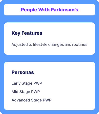
Figure 1. People with Parkinson’s Archetype
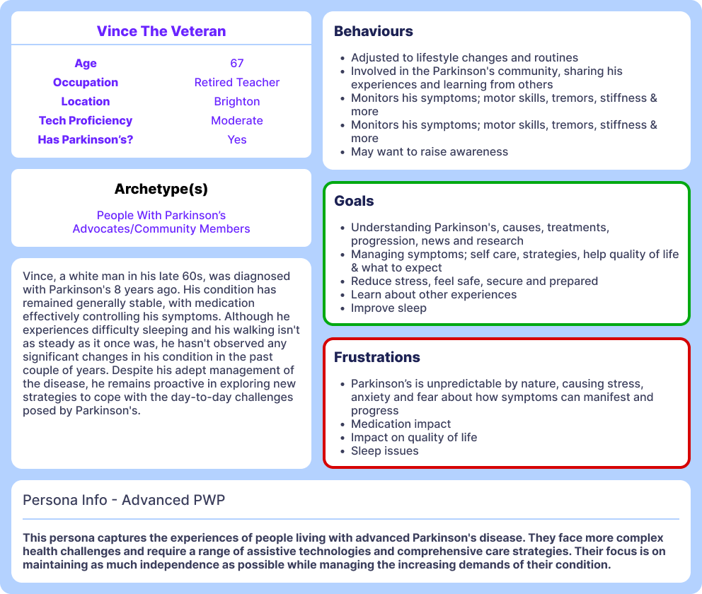
Figure 2. Advanced Person with Parkinson’s Persona
Problem
The Project Manager had concerns about accessibility gaps, friction in core journeys and inconsistencies in the user experience. These challenges were partly due to the delivery context: we were working without a shared design system and relying on external developers to build components. We expected there would be areas of non-compliance or missed edge cases.
To surface those issues and validate the user experience more rigorously, we commissioned an external accessibility audit. This wasn’t just about WCAG compliance, it was a chance to examine how well the product worked for real disabled users and to ensure our design lived up to its purpose.
My Role
As the Lead/Sole UX/UI designer on the Tech Guide, I led the accessibility redesign across the entire product experience.
My responsibilities included:
- Reviewing the audit findings and mapping them to user journeys
- Redesigning key flows and components to improve clarity and reduce cognitive load
- Collaborating closely with external developers to ensure improvements were feasible, well-documented and aligned to WCAG 2.2
- Co-creating the first formal accessibility documentation for our team, ensuring devs had ongoing guidance tied to real user needs
- Advocating for practical, user-first accessibility, avoiding overcorrection that could clutter or confuse and focusing instead on clarity, simplicity and real-life usability
This project sat at the intersection of UX design, accessibility operations and cross-functional collaboration. It required balancing technical constraints with user empathy and strategic thinking. While accessibility guidelines can appear rigid, we approached them with sensitivity to real-world user needs.
Throughout, we maintained a thoughtful balance between accessibility principles and practical implementation.
Process
The Audit
Conducted by an independent accessibility consultancy using:
- WCAG 2.2 reviews
- Live testing with disabled users
Tools covered: Screen readers (JAWS, NVDA, VoiceOver), Dragon NaturallySpeaking, ZoomText, keyboard-only nav, TalkBack, Zoom
Journeys tested: Catalogue, product pages, registration, profile, subscription, help & feedback flows
Key issues surfaced:
- Cluttered layouts & confusing navigation
- Unclear labelling across forms & filters
- Poor colour contrast and states
- High cognitive load for users
- Overly complex flows for simple tasks
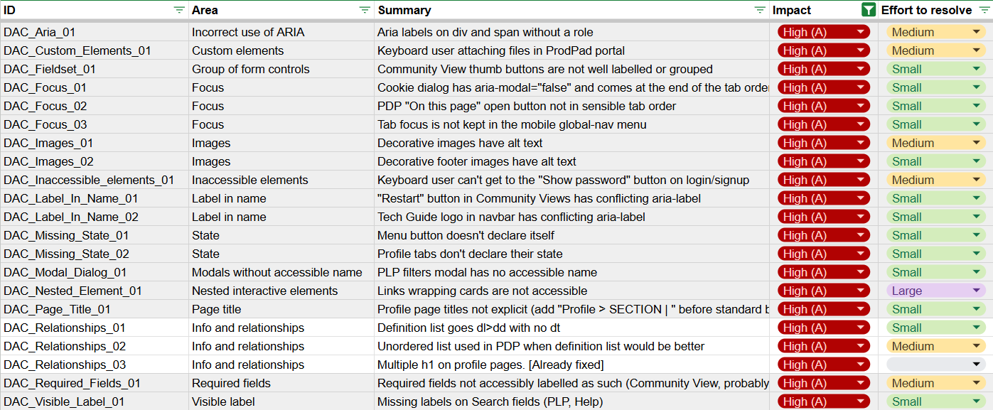
Figure 3. Excerpt of Audit results; High Impact issues
Key Actions
The following were done:
- Strengthened semantic structure for screen readers
- Took W3Cx Intro to Web Accessibility course
- Collaborated with devs to fix HTML & CSS issues
- Corrected & added aria labels
- Applied clearer labels across filters, buttons & fields
- Restructured layouts → less noise, easier scanning
- Increased colour contrast where needed
- Standardised interaction patterns to reduce guesswork
Impact in Action
I challenged overly broad audit recommendations by grounding them in real use cases, asking:
“How will this affect someone with Parkinson’s?”
For example, ‘Get your free copy’ CTA had the following problems:
- Voice control mismatch
- High cognitive load
- Lost context
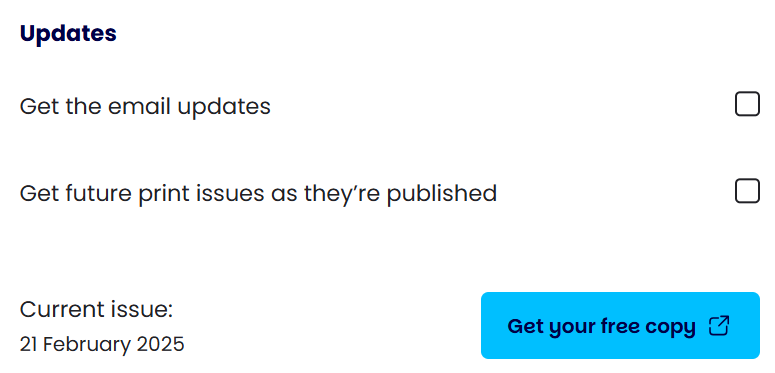
Figure 4. Get your free copy of the print edition CTA

Figure 5. Initial code
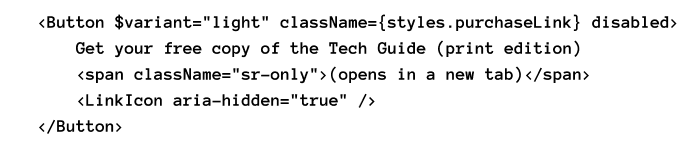
Figure 6. Solution code
Working alongside the developers, the solution was that:
- Screen readers now announce:“Get your free copy of the Tech Guide — print edition — opens in a new tab”
- Icon marked as decorative (aria-hidden)
- Context made explicit → reducing effort, improving clarity
Outcomes
- Stakeholder confidence grew as the audit revealed blind spots and gave evidence for change
- Closer developer collaboration meant measurable performance improvements
- New accessibility documentation created:
- Reviewed & annotated audit notes
- Added Parkinson’s-specific context (e.g. tremors & click targets)
- Linked fixes to personas & lived experience
- Built a reusable foundation for future projects
- Documentation first approach inspired accessibility decisions across the wider PUK ecosystem
Reflections
- Strategic accessibility matters → not just audit-passing, but barrier-reducing.
- Documentation = consistency → essential when partnering with external teams.
- Balance is key → avoided overloading users with extra affordances; prioritised clarity over clutter.
- Evidence-based changes → guided by audit + real testing, not assumptions.
- Accessibility is a spectrum → empathy and context matter; sometimes restraint (“saying no”) is just as valuable as adding more.
Let’s connect and work together!


Back to Portfolio
Accessible UX
Read time: 8 minutes
Project date: 2024 - 2025
Where accessibility standards meet real-world design
Redesigned the Parkinson’s UK Tech Guide for real accessibility, not just compliance, improving usability for people with Parkinson’s and embedding inclusive practice.
Accessibility
Strategy
DesignOps
TL;DR...a quick snapshot of the project!
Project
A UX-led accessibility audit and redesign of the Tech Guide, a platform helping people with Parkinson’s discover assistive technology.
Goal
Improve usability for people with Parkinson’s by addressing accessibility gaps, aligning with WCAG 2.2 and embedding inclusive practice into the product’s foundation.
My Role
Sole/lead UX designer. I led the end-to-end accessibility strategy, from reviewing audit findings and redesigning key flows, to collaborating with developers and co-authoring our first formal accessibility documentation.
Challenges
- No shared Design System
- External developers and inconsistent components
- User base with multiple impairments; motor, cognitive and visual, to name a few
- Audit findings had to be balanced with real-world usability
Outcomes
- Accessibility improvements across layout, labels, contrast, navigation and flows
- Created reusable accessibility documentation tailored to Parkinson’s symptoms
- Boosted stakeholder confidence and developer understanding
- Laid groundwork for accessibility consistency across Parkinson’s UK
Impact
Redesigned with empathy, not just compliance. Improved clarity and reduced friction for a vulnerable user base, while supporting long-term, scalable accessibility practices across the organisation.
Context
The Tech Guide (TG) is a digital platform developed by Parkinson’s UK (PUK) to help people with Parkinson’s discover and evaluate technology products that can support daily life. Many users are older adults with varying levels of digital confidence, often experiencing motor symptoms (e.g. tremors), cognitive challenges (e.g. memory, fatigue), or vision impairments.
While the initial design was grounded in accessibility heuristics and user empathy, concerns arose around real-world usability and consistency across the wider organisation. Other microsites at PUK had already undergone formal accessibility audits by external specialists. The Tech Guide followed suit, both to validate its approach and to align with inclusive practice across the organisation.
Figure 1. People with Parkinson’s Archetype
Figure 2. Advanced Person with Parkinson’s Persona
Problem
The Project Manager had concerns about accessibility gaps, friction in core journeys and inconsistencies in the user experience. These challenges were partly due to the delivery context: we were working without a shared design system and relying on external developers to build components. We expected there would be areas of non-compliance or missed edge cases.
To surface those issues and validate the user experience more rigorously, we commissioned an external accessibility audit. This wasn’t just about WCAG compliance, it was a chance to examine how well the product worked for real disabled users and to ensure our design lived up to its purpose.
No design system
External dev reliance
Accessibility gaps

UX inconsistencies
Missed edge cases
Compliance risks
My Role
As the Lead/Sole UX/UI designer on the Tech Guide, I led the accessibility redesign across the entire product experience.
My responsibilities included:
- Reviewing the audit findings and mapping them to user journeys
- Redesigning key flows and components to improve clarity and reduce cognitive load
- Collaborating closely with external developers to ensure improvements were feasible, well-documented and aligned to WCAG 2.2
- Co-creating the first formal accessibility documentation for our team, ensuring devs had ongoing guidance tied to real user needs
- Advocating for practical, user-first accessibility, avoiding overcorrection that could clutter or confuse and focusing instead on clarity, simplicity and real-life usability
This project sat at the intersection of UX design, accessibility operations and cross-functional collaboration. It required balancing technical constraints with user empathy and strategic thinking. While accessibility guidelines can appear rigid, we approached them with sensitivity to real-world user needs.
Throughout, we maintained a thoughtful balance between accessibility principles and practical implementation.
Process
The Audit
Conducted by an independent accessibility consultancy using:
- WCAG 2.2 reviews
- Live testing with disabled users
Tools covered: Screen readers (JAWS, NVDA, VoiceOver), Dragon NaturallySpeaking, ZoomText, keyboard-only nav, TalkBack, Zoom
Journeys tested: Catalogue, product pages, registration, profile, subscription, help & feedback flows
Key issues surfaced:
- Cluttered layouts & confusing navigation
- Unclear labelling across forms & filters
- Poor colour contrast and states
- High cognitive load for users
- Overly complex flows for simple tasks
Figure 3. Excerpt of Audit results; High Impact issues
Key Actions
The following were done:
- Strengthened semantic structure for screen readers
- Took W3Cx Intro to Web Accessibility course
- Collaborated with devs to fix HTML & CSS issues
- Corrected & added aria labels
- Applied clearer labels across filters, buttons & fields
- Restructured layouts → less noise, easier scanning
- Increased colour contrast where needed
- Standardised interaction patterns to reduce guesswork
Impact in Action
I challenged overly broad audit recommendations by grounding them in real use cases, asking:
“How will this affect someone with Parkinson’s?”
For example, ‘Get your free copy’ CTA had the following problems:
- Voice control mismatch
- High cognitive load
- Lost context
Figure 4. Get your free copy of the print edition CTA
Figure 5. Initial code
Figure 6. Solution code
Working alongside the developers, the solution was that:
- Screen readers now announce:“Get your free copy of the Tech Guide — print edition — opens in a new tab”
- Icon marked as decorative (aria-hidden)
- Context made explicit → reducing effort, improving clarity
Outcomes
- Stakeholder confidence grew as the audit revealed blind spots and gave evidence for change
- Closer developer collaboration meant measurable performance improvements
- New accessibility documentation created:
- Reviewed & annotated audit notes
- Added Parkinson’s-specific context (e.g. tremors & click targets)
- Linked fixes to personas & lived experience
- Built a reusable foundation for future projects
- Documentation first approach inspired accessibility decisions across the wider PUK ecosystem
Reflections
- Strategic accessibility matters → not just audit-passing, but barrier-reducing.
- Documentation = consistency → essential when partnering with external teams.
- Balance is key → avoided overloading users with extra affordances; prioritised clarity over clutter.
- Evidence-based changes → guided by audit + real testing, not assumptions.
- Accessibility is a spectrum → empathy and context matter; sometimes restraint (“saying no”) is just as valuable as adding more.
Let’s connect and work together!
Back to Portfolio
Accessible UX
Read time: 8 minutes
Project date: 2024 - 2025
Where accessibility standards meet real-world design
Redesigned the Parkinson’s UK Tech Guide for real accessibility, not just compliance, improving usability for people with Parkinson’s and embedding inclusive practice.
Accessibility
Strategy
DesignOps
TL;DR...a quick snapshot of the project!
Project
A UX-led accessibility audit and redesign of the Tech Guide, a platform helping people with Parkinson’s discover assistive technology.
Goal
Improve usability for people with Parkinson’s by addressing accessibility gaps, aligning with WCAG 2.2 and embedding inclusive practice into the product’s foundation.
My Role
Sole/lead UX designer. I led the end-to-end accessibility strategy, from reviewing audit findings and redesigning key flows, to collaborating with developers and co-authoring our first formal accessibility documentation.
Challenges
- No shared Design System
- External developers and inconsistent components
- User base with multiple impairments; motor, cognitive and visual, to name a few
- Audit findings had to be balanced with real-world usability
Outcomes
- Accessibility improvements across layout, labels, contrast, navigation and flows
- Created reusable accessibility documentation tailored to Parkinson’s symptoms
- Boosted stakeholder confidence and developer understanding
- Laid groundwork for accessibility consistency across Parkinson’s UK
Impact
Redesigned with empathy, not just compliance. Improved clarity and reduced friction for a vulnerable user base, while supporting long-term, scalable accessibility practices across the organisation.
Context
The Tech Guide (TG) is a digital platform developed by Parkinson’s UK (PUK) to help people with Parkinson’s discover and evaluate technology products that can support daily life. Many users are older adults with varying levels of digital confidence, often experiencing motor symptoms (e.g. tremors), cognitive challenges (e.g. memory, fatigue), or vision impairments.
While the initial design was grounded in accessibility heuristics and user empathy, concerns arose around real-world usability and consistency across the wider organisation. Other microsites at PUK had already undergone formal accessibility audits by external specialists. The Tech Guide followed suit, both to validate its approach and to align with inclusive practice across the organisation.
Figure 1. People with Parkinson’s Archetype
Figure 2. Advanced Person with Parkinson’s Persona
Problem
The Project Manager had concerns about accessibility gaps, friction in core journeys and inconsistencies in the user experience. These challenges were partly due to the delivery context: we were working without a shared design system and relying on external developers to build components. We expected there would be areas of non-compliance or missed edge cases.
To surface those issues and validate the user experience more rigorously, we commissioned an external accessibility audit. This wasn’t just about WCAG compliance, it was a chance to examine how well the product worked for real disabled users and to ensure our design lived up to its purpose.
No design system
External dev reliance
Accessibility gaps

UX inconsistencies
Missed edge cases
Compliance risks
My Role
As the Lead/Sole UX/UI designer on the Tech Guide, I led the accessibility redesign across the entire product experience.
My responsibilities included:
- Reviewing the audit findings and mapping them to user journeys
- Redesigning key flows and components to improve clarity and reduce cognitive load
- Collaborating closely with external developers to ensure improvements were feasible, well-documented and aligned to WCAG 2.2
- Co-creating the first formal accessibility documentation for our team, ensuring devs had ongoing guidance tied to real user needs
- Advocating for practical, user-first accessibility, avoiding overcorrection that could clutter or confuse and focusing instead on clarity, simplicity and real-life usability
This project sat at the intersection of UX design, accessibility operations and cross-functional collaboration. It required balancing technical constraints with user empathy and strategic thinking. While accessibility guidelines can appear rigid, we approached them with sensitivity to real-world user needs.
Throughout, we maintained a thoughtful balance between accessibility principles and practical implementation.
Process
The Audit
Conducted by an independent accessibility consultancy using:
- WCAG 2.2 reviews
- Live testing with disabled users
Tools covered: Screen readers (JAWS, NVDA, VoiceOver), Dragon NaturallySpeaking, ZoomText, keyboard-only nav, TalkBack, Zoom
Journeys tested: Catalogue, product pages, registration, profile, subscription, help & feedback flows
Key issues surfaced:
- Cluttered layouts & confusing navigation
- Unclear labelling across forms & filters
- Poor colour contrast and states
- High cognitive load for users
- Overly complex flows for simple tasks
Figure 3. Excerpt of Audit results; High Impact issues
Key Actions
The following were done:
- Strengthened semantic structure for screen readers
- Took W3Cx Intro to Web Accessibility course
- Collaborated with devs to fix HTML & CSS issues
- Corrected & added aria labels
- Applied clearer labels across filters, buttons & fields
- Restructured layouts → less noise, easier scanning
- Increased colour contrast where needed
- Standardised interaction patterns to reduce guesswork
Impact in Action
I challenged overly broad audit recommendations by grounding them in real use cases, asking:
“How will this affect someone with Parkinson’s?”
For example, ‘Get your free copy’ CTA had the following problems:
- Voice control mismatch
- High cognitive load
- Lost context
Figure 4. Get your free copy of the print edition CTA
Figure 5. Initial code
Figure 6. Solution code
Working alongside the developers, the solution was that:
- Screen readers now announce:“Get your free copy of the Tech Guide — print edition — opens in a new tab”
- Icon marked as decorative (aria-hidden)
- Context made explicit → reducing effort, improving clarity
Outcomes
- Stakeholder confidence grew as the audit revealed blind spots and gave evidence for change
- Closer developer collaboration meant measurable performance improvements
- New accessibility documentation created:
- Reviewed & annotated audit notes
- Added Parkinson’s-specific context (e.g. tremors & click targets)
- Linked fixes to personas & lived experience
- Built a reusable foundation for future projects
- Documentation first approach inspired accessibility decisions across the wider PUK ecosystem
Reflections
- Strategic accessibility matters → not just audit-passing, but barrier-reducing.
- Documentation = consistency → essential when partnering with external teams.
- Balance is key → avoided overloading users with extra affordances; prioritised clarity over clutter.
- Evidence-based changes → guided by audit + real testing, not assumptions.
- Accessibility is a spectrum → empathy and context matter; sometimes restraint (“saying no”) is just as valuable as adding more.
Let’s connect and work together!