Leonard Egwuekwe
Menu
Work
About
Contact

Back to Portfolio
Content Simplified
Read time: 6 minutes
Project date: 2024 - 2025
Turning complex content into a digestible and usable MVP catalogue
Redesigned the Parkinson’s UK Tech Guide to reduce cognitive load for users with Parkinson’s. As the sole UX designer, I simplified layouts, improved content clarity and tested with users.
Content Design
Strategy
Research
TL;DR...a quick snapshot of the project!
Project
Redesigning key areas of the Tech Guide to reduce cognitive load for users with Parkinson's.
Goal
Make the site easier to navigate, read and understand, particularly for users experiencing memory, focus, or fatigue-related symptoms.
My Role
Sole/lead UX designer. I led the cognitive accessibility improvements, collaborated with the content lead. Designed and tested interactive prototypes.
Challenges
- Overwhelming, text-heavy content
- Inconsistent third-party product information
- Structuring dense information for both desktop and mobile
- Balancing clarity with content depth
- Making the homepage more engaging without sacrificing accessibility
Outcomes
- Simplified layouts and improved content structure
- Clearer navigation and inline help
- Tested with users and validated improvements
- Designs adopted as templates for future updates
Impact
Improved clarity and confidence and reduced friction for a vulnerable user base. Positive feedback on calmness and ease of use. Helped embed cognitive accessibility as a design standard across the team.
Context
The Tech Guide (TG) is a digital platform developed by Parkinson’s UK (PUK) to help people with Parkinson’s discover and evaluate technology products that can support daily life. Many users are older adults with varying levels of digital confidence, often experiencing motor symptoms (e.g. tremors), cognitive challenges (e.g. memory, fatigue), or vision impairments.
As useful as the breadth of information present can be, it was clear that there was a risk of presenting too much information too quickly, lacked clear pathways and risked overwhelming the very audience it was meant to support.
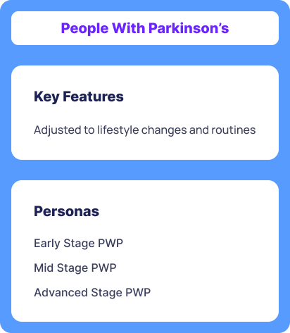
Figure 1. People with Parkinson’s Archetype
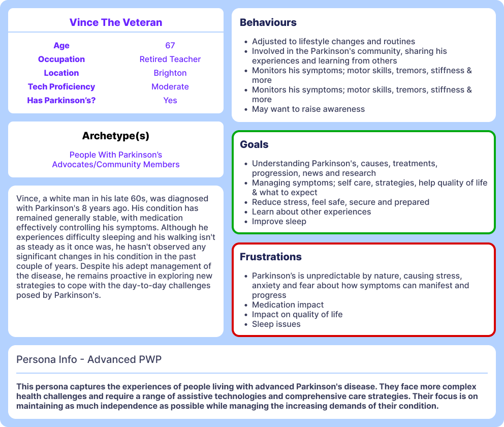
Figure 2. Advanced Person with Parkinson’s Persona
Problem
Several core issues were contributing to accessibility issues such as cognitive overload and tremors:
- The home page felt bland and “corporate”, with key content buried too far down the page
- Product Panel reviews contained helpful insights but were too text-heavy for users who struggled with focus or reading fatigue
- The product pages risked feeling too much like marketing rather than trusted guidance
- The site structure lacked clear navigation and hierarchy, especially across mobile and desktop, making it hard to find or return to key areas
This wasn’t just a design problem, it was a communication and content strategy challenge, compounded by the fact that external product information was often inconsistent or incomplete. We had to account for this variability while keeping the experience predictable and accessible.
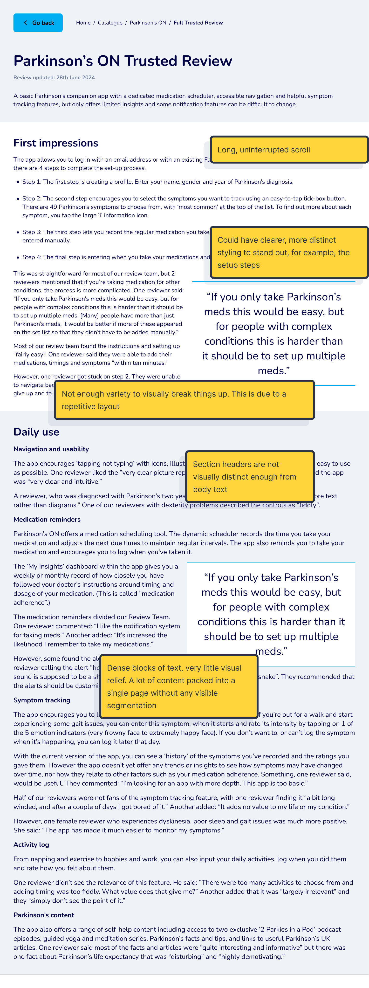
Figure 3. Initial design for Parkinson’s UK Panel Review with annotations
My Role
As the Lead/Sole UX/UI designer on the Tech Guide, I led the redesign and collaborated with the content team across the entire product experience.
My responsibilities included:
- Advocating for practical, user-first accessibility, avoiding overcorrection that could clutter or confuse and focusing instead on clarity, simplicity and real-life usability
- Collaborating closely with the team Content Lead to restructure and simplify information
- Created UX patterns to reduce friction and support user orientation
- Led the development of prototypes for usability testing
Process
Heuristic Review
This review allowed me to:
- Assess pages against cognitive accessibility best practices (e.g. Clear Language, Progressive Disclosure)
- Identify points of friction, such as long, unbroken text, dense filter controls, or unclear next steps
- Audit product pages and reviews to spot cognitive barriers in layout and structure
UX Design
The heuristic review highlighted various areas that needed adjustment:
- Home page: Prioritised product discovery higher up the page, cutting down on intro text and immediately offering a sense of what’s possible
- Product Panel reviews: Broke up text with pull quotes and pros/cons lists to aid scanning. Used clearer headings and reduced technical jargon
- Product pages: Focused on practical information (what it is, who it's for, who sells it) in a neutral, trustworthy tone
- Summaries: Provided summaries of the breadth of information at the top of the page in case users do not have the patience to read
- Added in-page navigation to help users jump between sections, reducing scrolling and supporting cognitive focus
- Mobile layout: Worked with the content team to explore how content hierarchy could shift responsively without sacrificing clarity
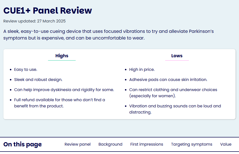
Figure 4. Summary and in page navigation added to Panel Review pages
Usability Testing
The following were done:
- Built interactive prototypes combining all the redesigned components
- Tested with users living with Parkinson’s to assess ease of use, comprehension and perceived effort
- Measured task completion and gathered self-reported feedback on clarity and calmness
Outcomes
- Users appreciated being able to jump between sections via in-page navigation, reducing effort and helping them stay oriented
- Users described the revised experience as “clearer”, “more calming” and “easier to follow”
- Task success improved and drop-off in review reading decreased
- Designs were adopted as best-practice templates for ongoing and future updates to the Tech Guide
- The approach helped inform broader team discussions about content governance and standardising product information
Reflections
This project reminded me that empathy isn’t just a mindset, it’s a design requirement. Designing for neurodivergent users means stripping back unnecessary friction, being intentional about structure and working across disciplines to create solutions that truly support users.
Small additions, like in-page navigation, made a disproportionately positive impact, especially for users who tire easily or get overwhelmed by dense information. These details added up to a calmer, more navigable experience.
I also learned how complex and bespoke content challenges can be, especially in a field like assistive tech, where clarity is critical, but consistency isn’t guaranteed.
Let’s connect and work together!


Back to Portfolio
Content Simplified
Read time: 6 minutes
Project date: 2024 - 2025
Turning complex content into a digestible and usable MVP catalogue
Redesigned the Parkinson’s UK Tech Guide to reduce cognitive load for users with Parkinson’s. As the sole UX designer, I simplified layouts, improved content clarity and tested with users.
Content Design
Strategy
Research
TL;DR...a quick snapshot of the project!
Project
Redesigning key areas of the Tech Guide to reduce cognitive load for users with Parkinson's.
Goal
Make the site easier to navigate, read and understand, particularly for users experiencing memory, focus, or fatigue-related symptoms.
My Role
Sole/lead UX designer. I led the cognitive accessibility improvements, collaborated with the content lead. Designed and tested interactive prototypes.
Challenges
- Overwhelming, text-heavy content
- Inconsistent third-party product information
- Structuring dense information for both desktop and mobile
- Balancing clarity with content depth
- Making the homepage more engaging without sacrificing accessibility
Outcomes
- Simplified layouts and improved content structure
- Clearer navigation and inline help
- Tested with users and validated improvements
- Designs adopted as templates for future updates
Impact
Improved clarity and confidence and reduced friction for a vulnerable user base. Positive feedback on calmness and ease of use. Helped embed cognitive accessibility as a design standard across the team.
Context
The Tech Guide (TG) is a digital platform developed by Parkinson’s UK (PUK) to help people with Parkinson’s discover and evaluate technology products that can support daily life. Many users are older adults with varying levels of digital confidence, often experiencing motor symptoms (e.g. tremors), cognitive challenges (e.g. memory, fatigue), or vision impairments.
As useful as the breadth of information present can be, it was clear that there was a risk of presenting too much information too quickly, lacked clear pathways and risked overwhelming the very audience it was meant to support.
Figure 1. People with Parkinson’s Archetype
Figure 2. Advanced Person with Parkinson’s Persona
Problem
Several core issues were contributing to accessibility issues such as cognitive overload and tremors:
- The home page felt bland and “corporate”, with key content buried too far down the page
- Product Panel reviews contained helpful insights but were too text-heavy for users who struggled with focus or reading fatigue
- The product pages risked feeling too much like marketing rather than trusted guidance
- The site structure lacked clear navigation and hierarchy, especially across mobile and desktop, making it hard to find or return to key areas
Bland, corporate homepage
Text heavy review content
Marketing led product pages
Weak information hierarchy

Failed to communicate value quickly
High cognitive load and reading fatigue
Reduced trust and perceived objectivity
Poor navigation across devices
This wasn’t just a design problem, it was a communication and content strategy challenge, compounded by the fact that external product information was often inconsistent or incomplete. We had to account for this variability while keeping the experience predictable and accessible.
Figure 3. Initial design for Parkinson’s UK Panel Review with annotations
My Role
As the Lead/Sole UX/UI designer on the Tech Guide, I led the redesign and collaborated with the content team across the entire product experience.
My responsibilities included:
- Advocating for practical, user-first accessibility, avoiding overcorrection that could clutter or confuse and focusing instead on clarity, simplicity and real-life usability
- Collaborating closely with the team Content Lead to restructure and simplify information
- Created UX patterns to reduce friction and support user orientation
- Led the development of prototypes for usability testing
Process
Heuristic Review
This review allowed me to:
- Assess pages against cognitive accessibility best practices (e.g. Clear Language, Progressive Disclosure)
- Identify points of friction, such as long, unbroken text, dense filter controls, or unclear next steps
- Audit product pages and reviews to spot cognitive barriers in layout and structure
UX Design
The heuristic review highlighted various areas that needed adjustment:
- Home page: Prioritised product discovery higher up the page, cutting down on intro text and immediately offering a sense of what’s possible
- Product Panel reviews: Broke up text with pull quotes and pros/cons lists to aid scanning. Used clearer headings and reduced technical jargon
- Product pages: Focused on practical information (what it is, who it's for, who sells it) in a neutral, trustworthy tone
- Summaries: Provided summaries of the breadth of information at the top of the page in case users do not have the patience to read
- Added in-page navigation to help users jump between sections, reducing scrolling and supporting cognitive focus
- Mobile layout: Worked with the content team to explore how content hierarchy could shift responsively without sacrificing clarity
Figure 4. Summary and in page navigation added to Panel Review pages
Usability Testing
The following were done:
- Built interactive prototypes combining all the redesigned components
- Tested with users living with Parkinson’s to assess ease of use, comprehension and perceived effort
- Measured task completion and gathered self-reported feedback on clarity and calmness
Outcomes
- Users appreciated being able to jump between sections via in-page navigation, reducing effort and helping them stay oriented
- Users described the revised experience as “clearer”, “more calming” and “easier to follow”
- Task success improved and drop-off in review reading decreased
- Designs were adopted as best-practice templates for ongoing and future updates to the Tech Guide
- The approach helped inform broader team discussions about content governance and standardising product information
Reflections
This project reminded me that empathy isn’t just a mindset, it’s a design requirement. Designing for neurodivergent users means stripping back unnecessary friction, being intentional about structure and working across disciplines to create solutions that truly support users.
Small additions, like in-page navigation, made a disproportionately positive impact, especially for users who tire easily or get overwhelmed by dense information. These details added up to a calmer, more navigable experience.
I also learned how complex and bespoke content challenges can be, especially in a field like assistive tech, where clarity is critical, but consistency isn’t guaranteed.
Let’s connect and work together!
Back to Portfolio
Content Simplified
Read time: 6 minutes
Project date: 2024 - 2025
Turning complex content into a digestible and usable MVP catalogue
Redesigned the Parkinson’s UK Tech Guide to reduce cognitive load for users with Parkinson’s. As the sole UX designer, I simplified layouts, improved content clarity and tested with users.
Content Design
Strategy
Research
TL;DR...a quick snapshot of the project!
Project
Redesigning key areas of the Tech Guide to reduce cognitive load for users with Parkinson's.
Goal
Make the site easier to navigate, read and understand, particularly for users experiencing memory, focus, or fatigue-related symptoms.
My Role
Sole/lead UX designer. I led the cognitive accessibility improvements, collaborated with the content lead. Designed and tested interactive prototypes.
Challenges
- Overwhelming, text-heavy content
- Inconsistent third-party product information
- Structuring dense information for both desktop and mobile
- Balancing clarity with content depth
- Making the homepage more engaging without sacrificing accessibility
Outcomes
- Simplified layouts and improved content structure
- Clearer navigation and inline help
- Tested with users and validated improvements
- Designs adopted as templates for future updates
Impact
Improved clarity and confidence and reduced friction for a vulnerable user base. Positive feedback on calmness and ease of use. Helped embed cognitive accessibility as a design standard across the team.
Context
The Tech Guide (TG) is a digital platform developed by Parkinson’s UK (PUK) to help people with Parkinson’s discover and evaluate technology products that can support daily life. Many users are older adults with varying levels of digital confidence, often experiencing motor symptoms (e.g. tremors), cognitive challenges (e.g. memory, fatigue), or vision impairments.
As useful as the breadth of information present can be, it was clear that there was a risk of presenting too much information too quickly, lacked clear pathways and risked overwhelming the very audience it was meant to support.
Figure 1. People with Parkinson’s Archetype
Figure 2. Advanced Person with Parkinson’s Persona
Problem
Several core issues were contributing to accessibility issues such as cognitive overload and tremors:
- The home page felt bland and “corporate”, with key content buried too far down the page
- Product Panel reviews contained helpful insights but were too text-heavy for users who struggled with focus or reading fatigue
- The product pages risked feeling too much like marketing rather than trusted guidance
- The site structure lacked clear navigation and hierarchy, especially across mobile and desktop, making it hard to find or return to key areas
Bland, corporate homepage
Text heavy review content
Marketing led product pages
Weak information hierarchy

Failed to communicate value quickly
High cognitive load and reading fatigue
Reduced trust and perceived objectivity
Poor navigation across devices
This wasn’t just a design problem, it was a communication and content strategy challenge, compounded by the fact that external product information was often inconsistent or incomplete. We had to account for this variability while keeping the experience predictable and accessible.
Figure 3. Initial design for Parkinson’s UK Panel Review with annotations
My Role
As the Lead/Sole UX/UI designer on the Tech Guide, I led the redesign and collaborated with the content team across the entire product experience.
My responsibilities included:
- Advocating for practical, user-first accessibility, avoiding overcorrection that could clutter or confuse and focusing instead on clarity, simplicity and real-life usability
- Collaborating closely with the team Content Lead to restructure and simplify information
- Created UX patterns to reduce friction and support user orientation
- Led the development of prototypes for usability testing
Process
Heuristic Review
This review allowed me to:
- Assess pages against cognitive accessibility best practices (e.g. Clear Language, Progressive Disclosure)
- Identify points of friction, such as long, unbroken text, dense filter controls, or unclear next steps
- Audit product pages and reviews to spot cognitive barriers in layout and structure
UX Design
The heuristic review highlighted various areas that needed adjustment:
- Home page: Prioritised product discovery higher up the page, cutting down on intro text and immediately offering a sense of what’s possible
- Product Panel reviews: Broke up text with pull quotes and pros/cons lists to aid scanning. Used clearer headings and reduced technical jargon
- Product pages: Focused on practical information (what it is, who it's for, who sells it) in a neutral, trustworthy tone
- Summaries: Provided summaries of the breadth of information at the top of the page in case users do not have the patience to read
- Added in-page navigation to help users jump between sections, reducing scrolling and supporting cognitive focus
- Mobile layout: Worked with the content team to explore how content hierarchy could shift responsively without sacrificing clarity
Figure 4. Summary and in page navigation added to Panel Review pages
Usability Testing
The following were done:
- Built interactive prototypes combining all the redesigned components
- Tested with users living with Parkinson’s to assess ease of use, comprehension and perceived effort
- Measured task completion and gathered self-reported feedback on clarity and calmness
Outcomes
- Users appreciated being able to jump between sections via in-page navigation, reducing effort and helping them stay oriented
- Users described the revised experience as “clearer”, “more calming” and “easier to follow”
- Task success improved and drop-off in review reading decreased
- Designs were adopted as best-practice templates for ongoing and future updates to the Tech Guide
- The approach helped inform broader team discussions about content governance and standardising product information
Reflections
This project reminded me that empathy isn’t just a mindset, it’s a design requirement. Designing for neurodivergent users means stripping back unnecessary friction, being intentional about structure and working across disciplines to create solutions that truly support users.
Small additions, like in-page navigation, made a disproportionately positive impact, especially for users who tire easily or get overwhelmed by dense information. These details added up to a calmer, more navigable experience.
I also learned how complex and bespoke content challenges can be, especially in a field like assistive tech, where clarity is critical, but consistency isn’t guaranteed.
Let’s connect and work together!