Leonard Egwuekwe
Menu
Work
About
Contact

Back to Portfolio
Dashboard Implementation
Read time: 8 minutes
Project date: 2022 - 2023
Optimising real-time collaboration for critical response
Replaced modal-heavy incident workflows with a modular, customisable dashboard. Improving visibility, performance, and collaboration during live incidents.
Dashboard UX
Data Visualisation
Systems Design
TL;DR...a quick snapshot of the project!
Project
Redesigned Cutover’s incident management experience by replacing modal-heavy workflows with a customisable, real-time dashboard that enhanced visibility, collaboration, and performance during live incidents.
Goal
Improve visibility and usability of incident workflows, replacing modal-heavy designs.
My Role
Junior UX Designer working in close collaboration with a Product Designer. I contributed to research, ideation, design and stakeholder alignment.
Challenges
- Performance issues
- Hidden features
- Fragmented workflows
Outcomes
- Customisable real-time dashboard
- Improved adoption
- Reduced reliance on workarounds and CSM’s
Impact
Faster incident response, stakeholder confidence, scalable foundation
Context
Cutover’s platform helps organisations orchestrate live incident response activities, with features such as severity tracking, status updates, and an activity feed.
At the time, the platform relied heavily on modals, making collaboration slow and limiting visibility. Users often resorted to workarounds instead of using the platform as intended.
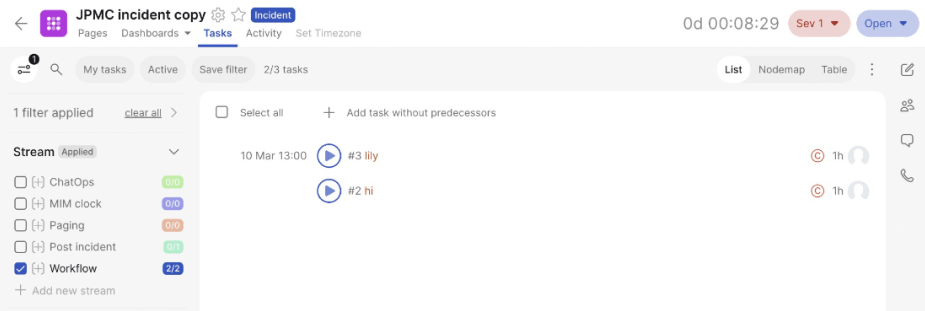
Figure 1. Initial form of an incident management dashboard
Problem
We discovered a variety of problems that had a great impact on the users speed and efficiency when tackling incidents.
My Role
As a Junior UX/UI designer partnering closely with BAs and client users in different time zones
- Evaluated low-fidelity designs and BA findings
- Led research, ideation, and visual design of a new incident dashboard
- Aligned stakeholders on strategy, scope, and project limitations
Process
Research
- Benchmarking dashboards (Notion, Power BI, Klipfolio, Tableau)
- Analysed rationale behind dashboard visualisation strategies
Stakeholder Alignment
- Validated assumptions, identified knowledge gaps
- Established clear communication channels for global teams
Design Strategy & Ideation
- Explored Pods as flexible containers: collapsible, expandable, re-arrangeable
- Prioritised key features to reduce clutter and improve performance
- Introduced a customisable dashboard inspired by Adobe Illustrator’s modular workspace
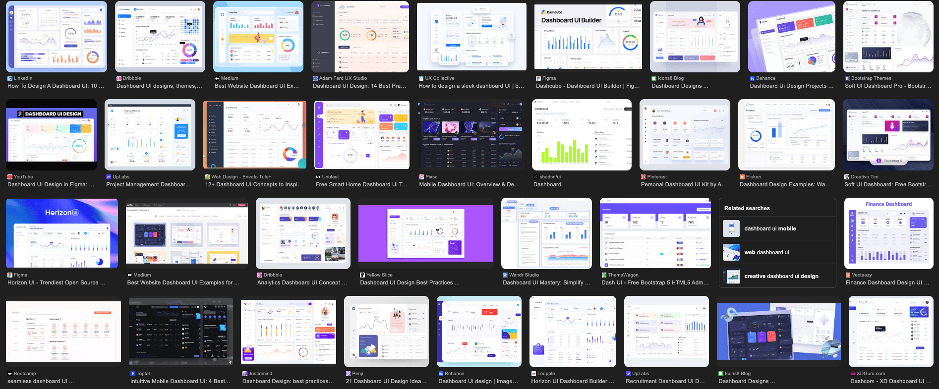
Figure 2. Google search/dashboard inspiration
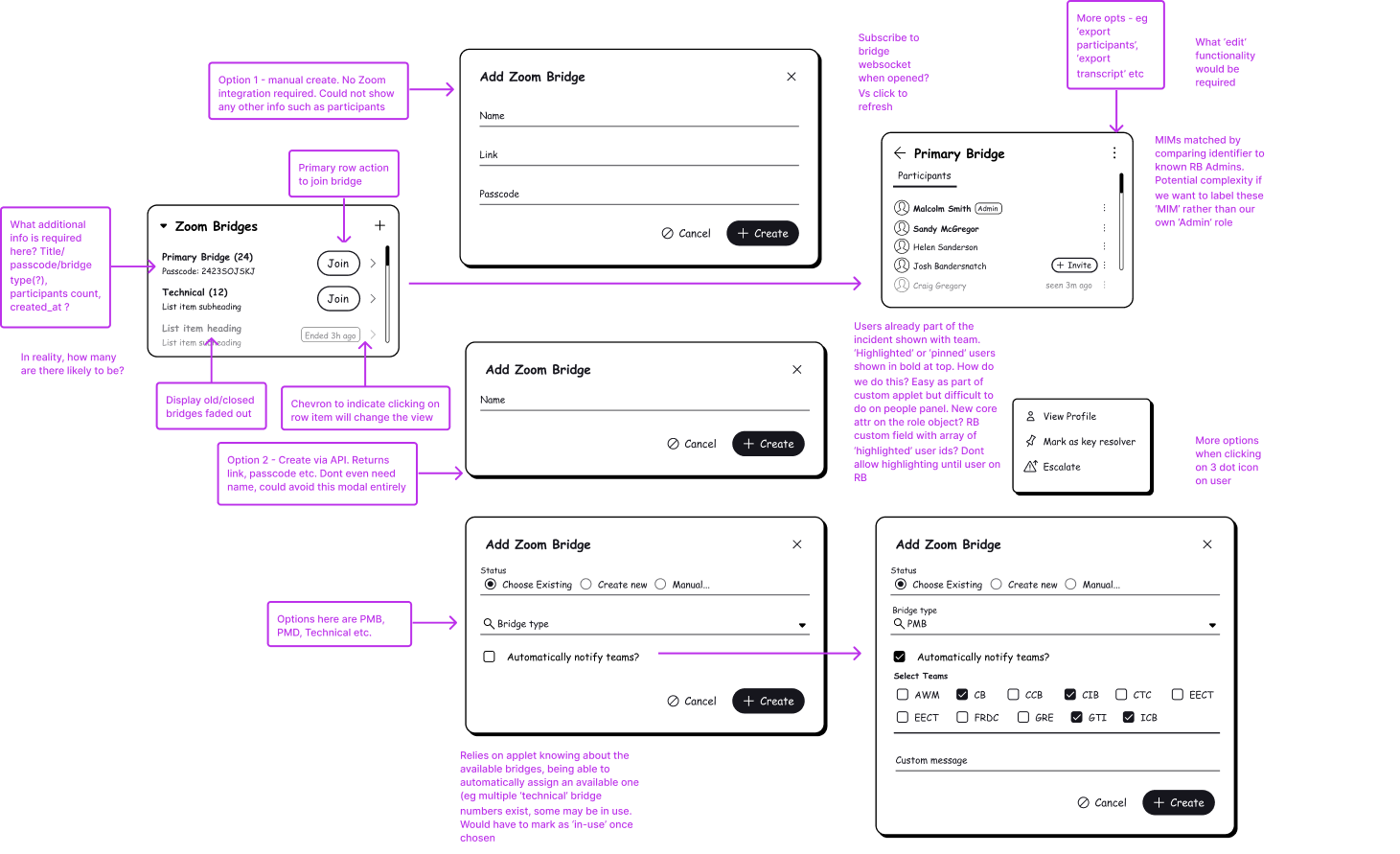
Figure 3. Lofi designs of pods/widgets and the questions around them
Impact in Action
During testing of the Pods concept:
- Severity, status, and activity feeds were surfaced in one view, eliminating the need for multiple modals
- Users gained immediate visibility, enabling faster decisions and smoother collaboration
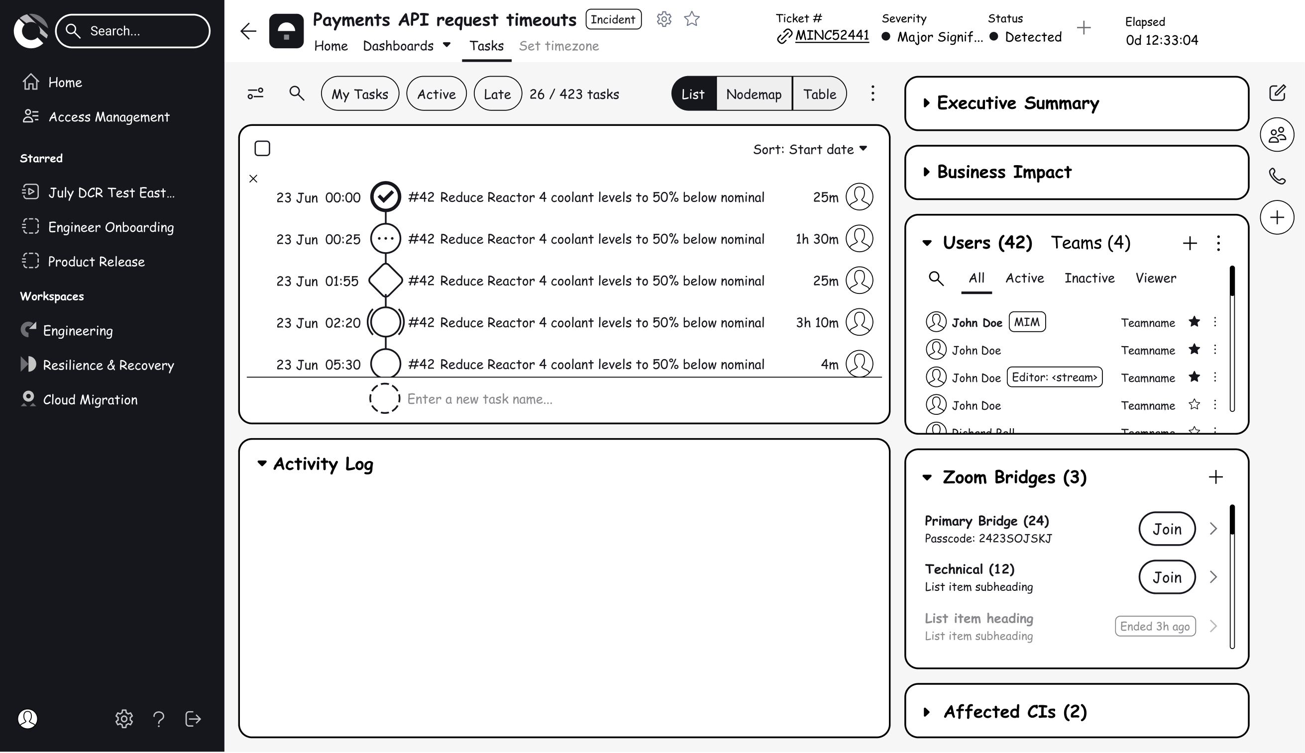
Figure 4. Lofi design of new dashboard
Outcomes
- Improved visibility: Critical features accessible without modal disruptions
- Customisability: Teams configured dashboards to match workflows
- Adoption confidence: Stakeholders validated prototypes; fewer workarounds
- Future-ready foundation: Real-time updates scalable across desktop and mobile
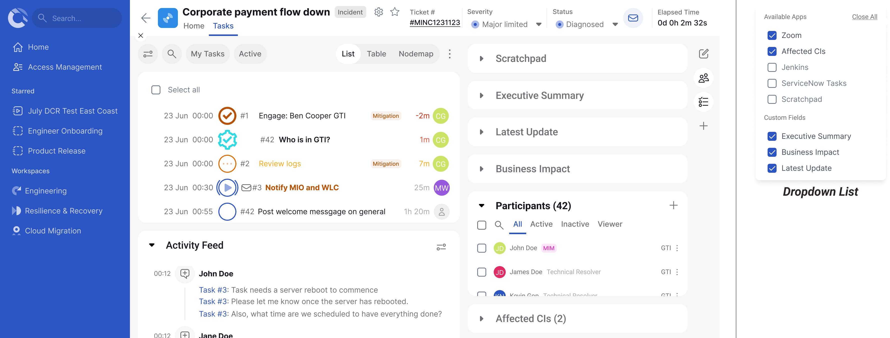
Figure 5. High fidelity design ashboard
Reflections
This project reinforced the value of removing friction in high-stakes workflows. By replacing modal-heavy designs with a modular, customisable dashboard, we enabled users to access critical information quickly, make faster decisions, and collaborate more effectively. It highlighted the importance of engaging stakeholders continuously, especially across different time zones, to validate assumptions and maintain alignment. The work also underscored the need for scalable, consistent design solutions that can evolve over time, laying a strong foundation for future iterations, usability testing, and style guide development.
Let’s connect and work together!


Back to Portfolio
Dashboard Implementation
Read time: 8 minutes
Project date: 2022 - 2023
Optimising real-time collaboration for critical response
Replaced modal-heavy incident workflows with a modular, customisable dashboard. Improving visibility, performance, and collaboration during live incidents.
Dashboard UX
Data Visualisation
Systems Design
TL;DR...a quick snapshot of the project!
Project
Redesigned Cutover’s incident management experience by replacing modal-heavy workflows with a customisable, real-time dashboard that enhanced visibility, collaboration, and performance during live incidents.
Goal
Improve visibility and usability of incident workflows, replacing modal-heavy designs.
My Role
Junior UX Designer working in close collaboration with a Product Designer. I contributed to research, ideation, design and stakeholder alignment.
Challenges
- Performance issues
- Hidden features
- Fragmented workflows
Outcomes
- Customisable real-time dashboard
- Improved adoption
- Reduced reliance on workarounds and CSM’s
Impact
Faster incident response, stakeholder confidence, scalable foundation
Context
Cutover’s platform helps organisations orchestrate live incident response activities, with features such as severity tracking, status updates, and an activity feed.
At the time, the platform relied heavily on modals, making collaboration slow and limiting visibility. Users often resorted to workarounds instead of using the platform as intended.
Figure 1. Initial form of an incident management dashboard
Problem
We discovered a variety of problems that had a great impact on the users speed and efficiency when tackling incidents.
Modal heavy workflows
Limited feature visibility
High interaction cost in high pressure scenarios
Performance friction during live incidents
Fragmented experience across features

Disrupted collaboration by hiding critical information
Users could not assess severity, status, or activity at a glance
Increased cognitive load and slowed decision-making
Users experienced delays that impeded workflow efficiency
Teams resorted to workarounds instead of using the platform as intended
My Role
As a Junior UX/UI designer partnering closely with BAs and client users in different time zones
- Evaluated low-fidelity designs and BA findings
- Led research, ideation, and visual design of a new incident dashboard
- Aligned stakeholders on strategy, scope, and project limitations
Process
Research
- Benchmarking dashboards (Notion, Power BI, Klipfolio, Tableau)
- Analysed rationale behind dashboard visualisation strategies
Stakeholder Alignment
- Validated assumptions, identified knowledge gaps
- Established clear communication channels for global teams
Design Strategy & Ideation
- Explored Pods as flexible containers: collapsible, expandable, re-arrangeable
- Prioritised key features to reduce clutter and improve performance
- Introduced a customisable dashboard inspired by Adobe Illustrator’s modular workspace
Figure 2. Google search/dashboard inspiration
Figure 3. Lofi designs of pods/widgets and the questions around them
Impact in Action
During testing of the Pods concept:
- Severity, status, and activity feeds were surfaced in one view, eliminating the need for multiple modals
- Users gained immediate visibility, enabling faster decisions and smoother collaboration
Figure 4. Lofi design of new dashboard
Outcomes
- Improved visibility: Critical features accessible without modal disruptions
- Customisability: Teams configured dashboards to match workflows
- Adoption confidence: Stakeholders validated prototypes; fewer workarounds
- Future-ready foundation: Real-time updates scalable across desktop and mobile
Figure 5. High fidelity design ashboard
Reflections
This project reinforced the value of removing friction in high-stakes workflows. By replacing modal-heavy designs with a modular, customisable dashboard, we enabled users to access critical information quickly, make faster decisions, and collaborate more effectively. It highlighted the importance of engaging stakeholders continuously, especially across different time zones, to validate assumptions and maintain alignment. The work also underscored the need for scalable, consistent design solutions that can evolve over time, laying a strong foundation for future iterations, usability testing, and style guide development.
Let’s connect and work together!
Back to Portfolio
Dashboard Implementation
Read time: 8 minutes
Project date: 2022 - 2023
Optimising real-time collaboration for critical response
Replaced modal-heavy incident workflows with a modular, customisable dashboard. Improving visibility, performance, and collaboration during live incidents.
Dashboard UX
Data Visualisation
Systems Design
TL;DR...a quick snapshot of the project!
Project
Redesigned Cutover’s incident management experience by replacing modal-heavy workflows with a customisable, real-time dashboard that enhanced visibility, collaboration, and performance during live incidents.
Goal
Improve visibility and usability of incident workflows, replacing modal-heavy designs.
My Role
Junior UX Designer working in close collaboration with a Product Designer. I contributed to research, ideation, design and stakeholder alignment.
Challenges
- Performance issues
- Hidden features
- Fragmented workflows
Outcomes
- Customisable real-time dashboard
- Improved adoption
- Reduced reliance on workarounds and CSM’s
Impact
Faster incident response, stakeholder confidence, scalable foundation
Context
Cutover’s platform helps organisations orchestrate live incident response activities, with features such as severity tracking, status updates, and an activity feed.
At the time, the platform relied heavily on modals, making collaboration slow and limiting visibility. Users often resorted to workarounds instead of using the platform as intended.
Figure 1. Initial form of an incident management dashboard
Problem
We discovered a variety of problems that had a great impact on the users speed and efficiency when tackling incidents.
Modal heavy workflows
Limited feature visibility
High interaction cost in high pressure scenarios
Performance friction during live incidents
Fragmented experience across features
Disrupted collaboration by hiding critical information
Users could not assess severity, status, or activity at a glance
Increased cognitive load and slowed decision-making
Users experienced delays that impeded workflow efficiency
Teams resorted to workarounds instead of using the platform as intended
My Role
As a Junior UX/UI designer partnering closely with BAs and client users in different time zones
- Evaluated low-fidelity designs and BA findings
- Led research, ideation, and visual design of a new incident dashboard
- Aligned stakeholders on strategy, scope, and project limitations
Process
Research
- Benchmarking dashboards (Notion, Power BI, Klipfolio, Tableau)
- Analysed rationale behind dashboard visualisation strategies
Stakeholder Alignment
- Validated assumptions, identified knowledge gaps
- Established clear communication channels for global teams
Design Strategy & Ideation
- Explored Pods as flexible containers: collapsible, expandable, re-arrangeable
- Prioritised key features to reduce clutter and improve performance
- Introduced a customisable dashboard inspired by Adobe Illustrator’s modular workspace
Figure 2. Google search/dashboard inspiration
Figure 3. Lofi designs of pods/widgets and the questions around them
Impact in Action
During testing of the Pods concept:
- Severity, status, and activity feeds were surfaced in one view, eliminating the need for multiple modals
- Users gained immediate visibility, enabling faster decisions and smoother collaboration
Figure 4. Lofi design of new dashboard
Outcomes
- Improved visibility: Critical features accessible without modal disruptions
- Customisability: Teams configured dashboards to match workflows
- Adoption confidence: Stakeholders validated prototypes; fewer workarounds
- Future-ready foundation: Real-time updates scalable across desktop and mobile
Figure 5. High fidelity design ashboard
Reflections
This project reinforced the value of removing friction in high-stakes workflows. By replacing modal-heavy designs with a modular, customisable dashboard, we enabled users to access critical information quickly, make faster decisions, and collaborate more effectively. It highlighted the importance of engaging stakeholders continuously, especially across different time zones, to validate assumptions and maintain alignment. The work also underscored the need for scalable, consistent design solutions that can evolve over time, laying a strong foundation for future iterations, usability testing, and style guide development.
Let’s connect and work together!