Leonard Egwuekwe
Menu
Work
About
Contact

Back to Portfolio
Enhancing Self-Serve Functionality
Read time: 8 minutes
Project date: 2022 - 2023
Empowering users through clearer, self-serve experiences
Making task management intuitive and reducing reliance on support.
Service Design
Self-Serve
Platform UX
TL;DR...a quick snapshot of the project!
Project
Enhancing self-serve functionality within Cutover’s project management platform.
Goal
Reduce reliance on support teams by improving navigation, task visibility, and usability through self-service features.
My Role
Junior UX Designer/Consultant working in close collaboration with a Product Designer. I contributed to research, ideation, prototyping, and usability testing.
Challenges
- Overwhelming task lists with poor filtering
- Inconsistent terminology
- Lack of clear task status indicators
- Limited time for usability testing
Outcomes
- Introduced “My Tasks” section for targeted access
- Widget layout chosen (64.3% preference) for clarity & usability
- Colour-coded status and email notifications for better task tracking
- Streamlined terminology across the platform
Impact
Improved task focus, reduced user confusion, and laid the foundation for future self-service and accessibility enhancements.
Context
Cutover is a project management platform built with a comprehensive set of features for complex team workflows. However, its versatility introduced usability challenges for end-users.
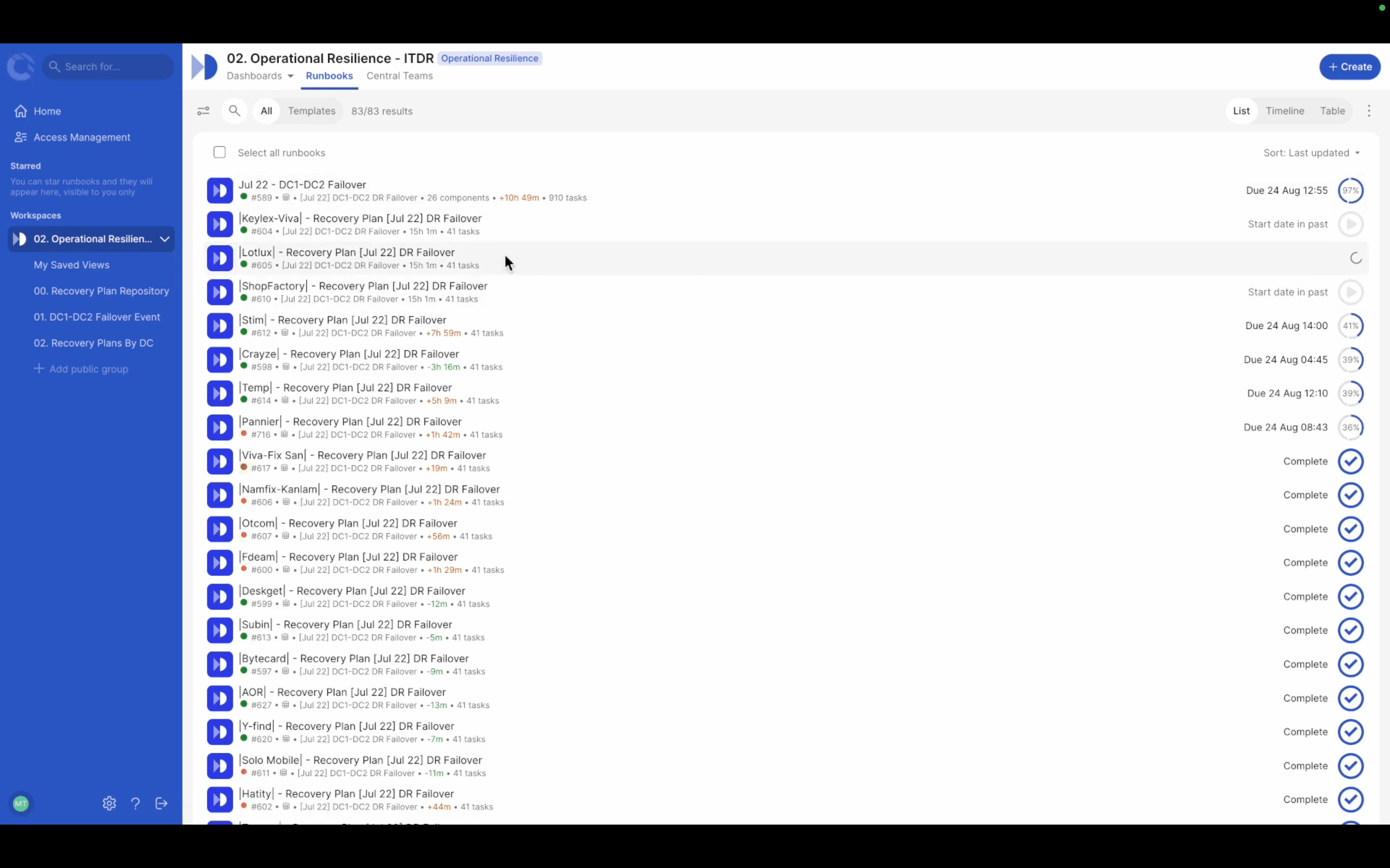
Figure 1. Example Runbook List
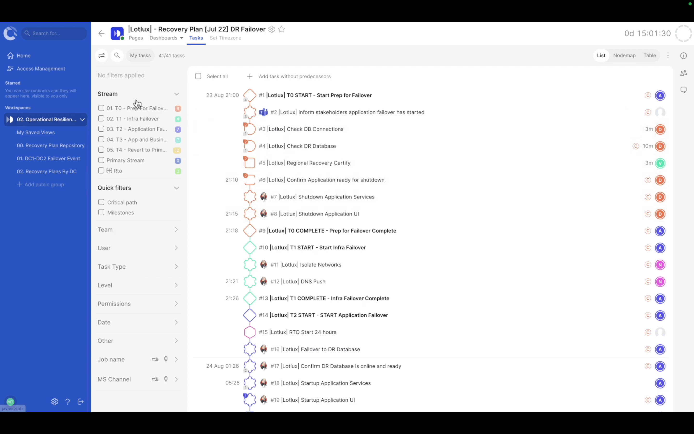
Figure 2. Example Task List
Problem
The platform offered powerful functionality, but its complexity made everyday tasks harder than they needed to be.
My Role
As a Junior UX/UI designer collaborating closely with a Product Designer on this project, my responsibilities included:
- Stakeholder alignment
- User research and competitive analysis
- Ideation and prototyping
- Usability testing with 28 participants
Process
Stakeholder Interviews
Expectations were managed, where we:
- Aligned on project scope, timelines, and expectations
- Exposed assumptions and knowledge gaps
- Set realistic boundaries and communication channels
Research
- Behaviour data analysis (via analysts)
- Competitive review of Notion, Airtable, Excel, Trello
- User surveys, usability testing, and interviews
- Developed persona: Task Executor
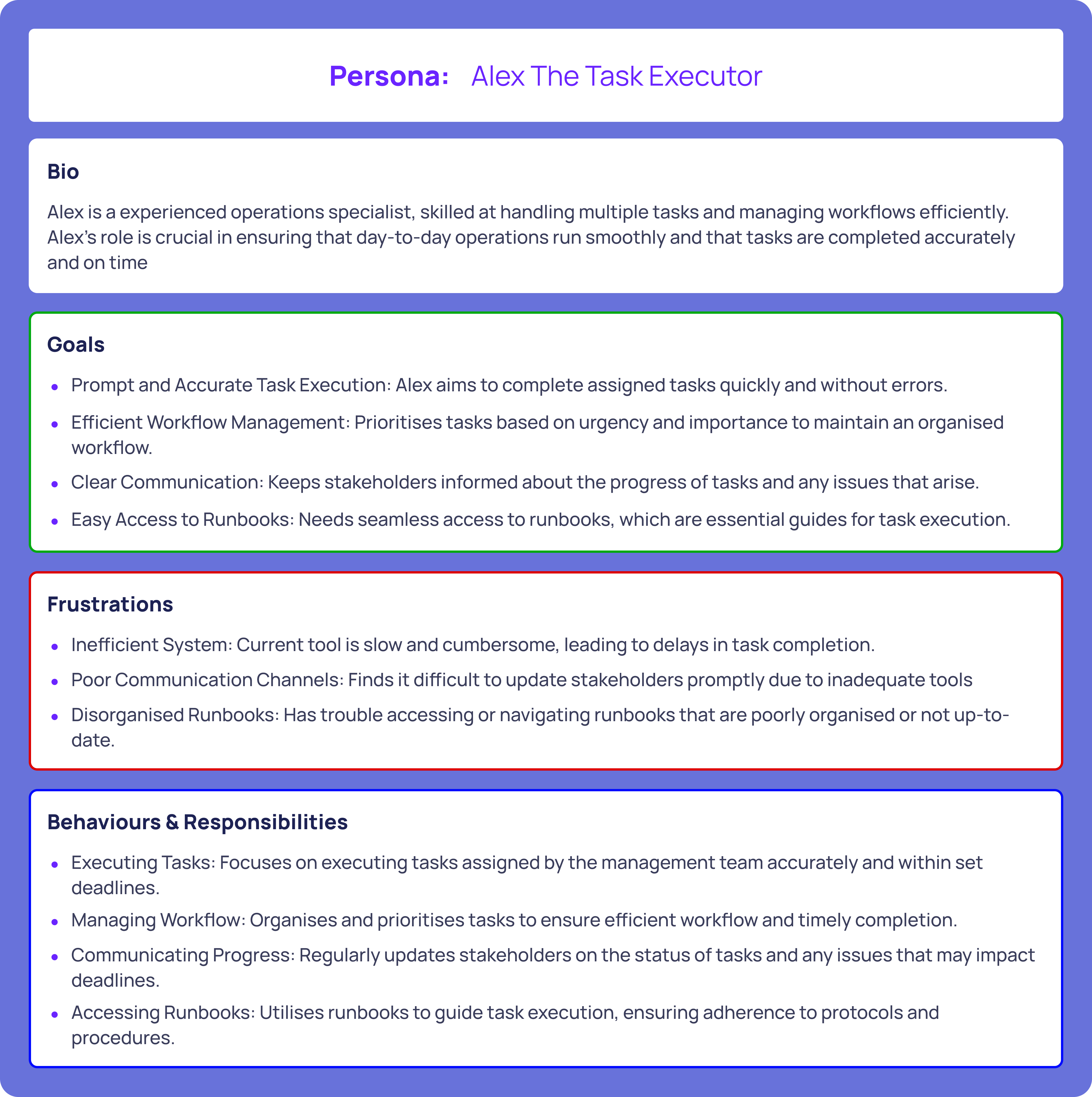
Figure 3. Task Executor Persona
Findings
- Complex navigation and overwhelming task lists
- Inconsistent terminology
- Missing notifications on task states
- Ineffective filters to locate tasks
Ideation & Design
- Information Overload & Customisation: “My Tasks” page was created, table added, grouping/filtering, more whitespace
- Tracking Updates: colour-coded status column & email reminders
- Terminology: simplified, consistent vocabulary
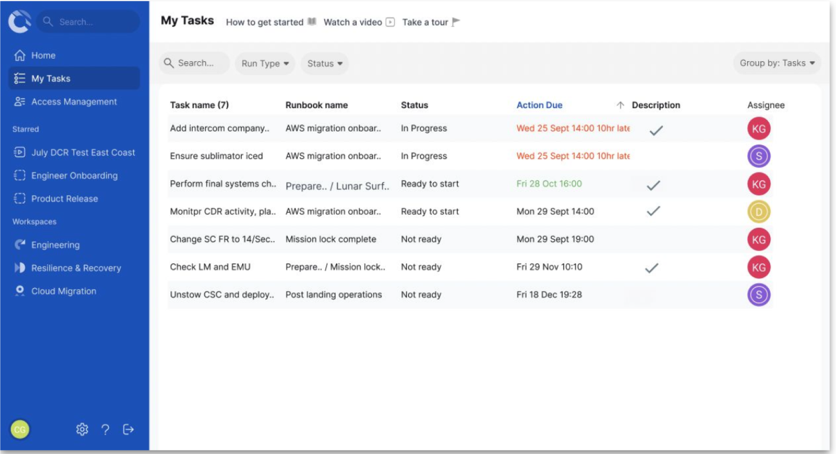
Figure 4. Potential solution 1: Table Layout
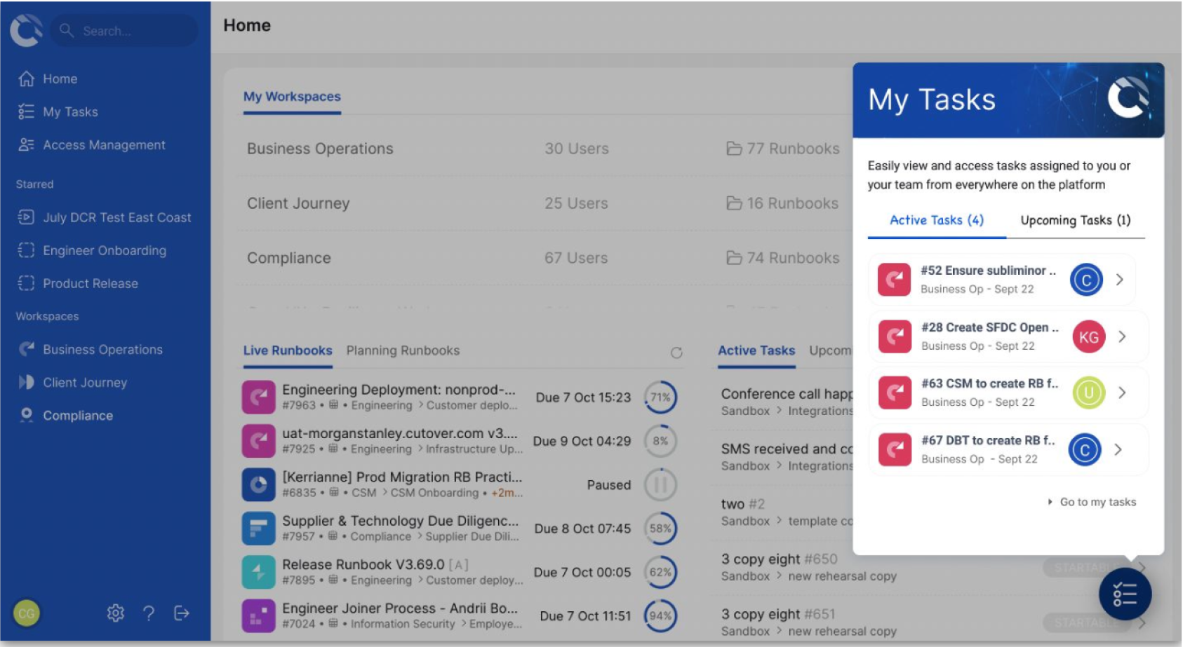
Figure 5. Potential solution 2: Widget Layout
Outcomes
- Table Layout vs. Widget Layout
- 28 participants, mix of moderated/unmoderated testing
- 64.3% preferred Widget Layout, so it was adopted as final direction
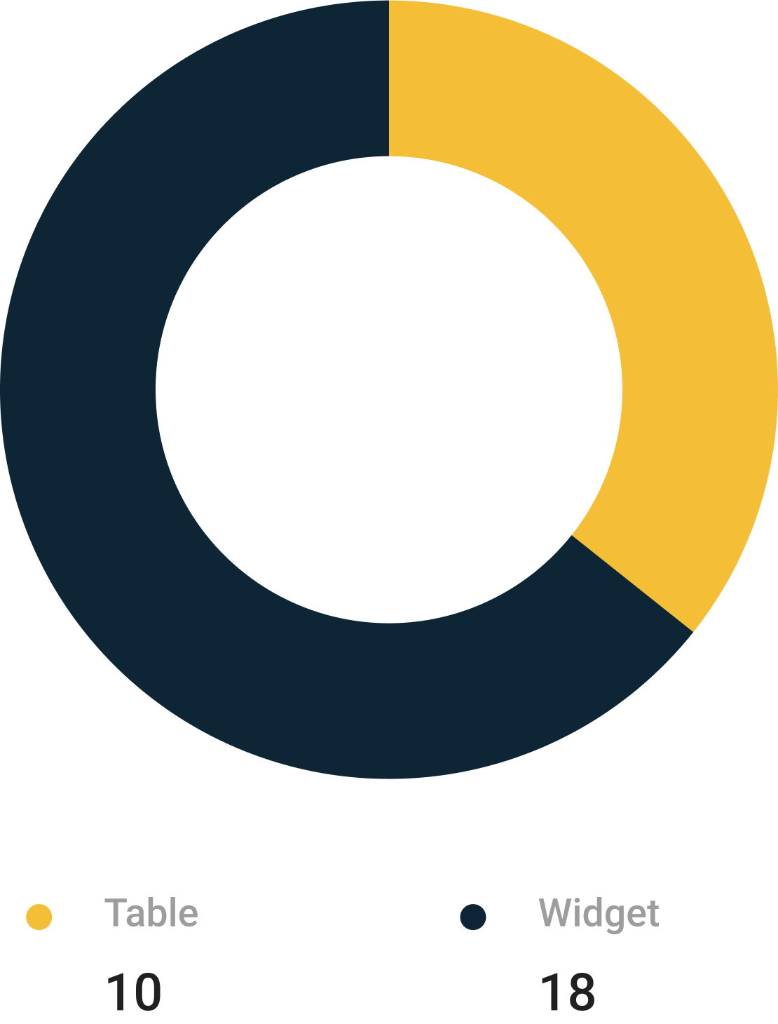
Figure 6. Testing Results
Given that the users couldn’t quickly locate relevant tasks in an overloaded workspace, the solution was to introduce “My Tasks” in the primary navigation and added grouping/filtering features, reducing noise and personalising task views.
The designs had the following impact:
- Reduced information overload meant cleaner, task-focused interface
- Increased usability via Widget Layout adoption
- Improved tracking through email reminders & colour-coded states
- Simplified terminology boosted clarity and accessibility
Reflections
Even short projects benefit from multi-method research (analytics, surveys, testing). Customisation is not “nice to have” but critical in self-serve systems, users need control to feel empowered. It would be beneficial to consider accessibility metrics and service design layers to reinforce inclusivity and long-term scalability.
Let’s connect and work together!


Back to Portfolio
Enhancing Self-Serve Functionality
Read time: 8 minutes
Project date: 2022 - 2023
Empowering users through clearer, self-serve experiences
Making task management intuitive and reducing reliance on support.
Service Design
Self-Serve
Platform UX
TL;DR...a quick snapshot of the project!
Project
Enhancing self-serve functionality within Cutover’s project management platform.
Goal
Reduce reliance on support teams by improving navigation, task visibility, and usability through self-service features.
My Role
Junior UX Designer/Consultant working in close collaboration with a Product Designer. I contributed to research, ideation, prototyping, and usability testing.
Challenges
- Overwhelming task lists with poor filtering
- Inconsistent terminology
- Lack of clear task status indicators
- Limited time for usability testing
Outcomes
- Introduced “My Tasks” section for targeted access
- Widget layout chosen (64.3% preference) for clarity & usability
- Colour-coded status and email notifications for better task tracking
- Streamlined terminology across the platform
Impact
Improved task focus, reduced user confusion, and laid the foundation for future self-service and accessibility enhancements.
Context
Cutover is a project management platform built with a comprehensive set of features for complex team workflows. However, its versatility introduced usability challenges for end-users.
Figure 1. Example Runbook List
Figure 2. Example Task List
Problem
The platform offered powerful functionality, but its complexity made everyday tasks harder than they needed to be.
Platform is complex
Information overload
Weak self-service affordances

Users struggled to locate & understand tasks
Higher cognitive load and navigation friction
Increased training and support dependency
My Role
As a Junior UX/UI designer collaborating closely with a Product Designer on this project, my responsibilities included:
- Stakeholder alignment
- User research and competitive analysis
- Ideation and prototyping
- Usability testing with 28 participants
Process
Stakeholder Interviews
Expectations were managed, where we:
- Aligned on project scope, timelines, and expectations
- Exposed assumptions and knowledge gaps
- Set realistic boundaries and communication channels
Research
- Behaviour data analysis (via analysts)
- Competitive review of Notion, Airtable, Excel, Trello
- User surveys, usability testing, and interviews
- Developed persona: Task Executor
Figure 3. Task Executor Persona
Findings
- Complex navigation and overwhelming task lists
- Inconsistent terminology
- Missing notifications on task states
- Ineffective filters to locate tasks
Ideation & Design
- Information Overload & Customisation: “My Tasks” page was created, table added, grouping/filtering, more whitespace
- Tracking Updates: colour-coded status column & email reminders
- Terminology: simplified, consistent vocabulary
Figure 4. Potential solution 1: Table Layout
Figure 5. Potential solution 2: Widget Layout
Outcomes
- Table Layout vs. Widget Layout
- 28 participants, mix of moderated/unmoderated testing
- 64.3% preferred Widget Layout, so it was adopted as final direction
Figure 6. Testing Results
Given that the users couldn’t quickly locate relevant tasks in an overloaded workspace, the solution was to introduce “My Tasks” in the primary navigation and added grouping/filtering features, reducing noise and personalising task views.
The designs had the following impact:
- Reduced information overload meant cleaner, task-focused interface
- Increased usability via Widget Layout adoption
- Improved tracking through email reminders & colour-coded states
- Simplified terminology boosted clarity and accessibility
Reflections
Even short projects benefit from multi-method research (analytics, surveys, testing). Customisation is not “nice to have” but critical in self-serve systems, users need control to feel empowered. It would be beneficial to consider accessibility metrics and service design layers to reinforce inclusivity and long-term scalability.
Let’s connect and work together!
Back to Portfolio
Enhancing Self-Serve Functionality
Read time: 8 minutes
Project date: 2022 - 2023
Empowering users through clearer, self-serve experiences
Making task management intuitive and reducing reliance on support.
Service Design
Self-Serve
Platform UX
TL;DR...a quick snapshot of the project!
Project
Enhancing self-serve functionality within Cutover’s project management platform.
Goal
Reduce reliance on support teams by improving navigation, task visibility, and usability through self-service features.
My Role
Junior UX Designer/Consultant working in close collaboration with a Product Designer. I contributed to research, ideation, prototyping, and usability testing.
Challenges
- Overwhelming task lists with poor filtering
- Inconsistent terminology
- Lack of clear task status indicators
- Limited time for usability testing
Outcomes
- Introduced “My Tasks” section for targeted access
- Widget layout chosen (64.3% preference) for clarity & usability
- Colour-coded status and email notifications for better task tracking
- Streamlined terminology across the platform
Impact
Improved task focus, reduced user confusion, and laid the foundation for future self-service and accessibility enhancements.
Context
Cutover is a project management platform built with a comprehensive set of features for complex team workflows. However, its versatility introduced usability challenges for end-users.
Figure 1. Example Runbook List
Figure 2. Example Task List
Problem
The platform offered powerful functionality, but its complexity made everyday tasks harder than they needed to be.
Platform is complex
Information overload
Weak self-service affordances
Users struggled to locate & understand tasks
Higher cognitive load and navigation friction
Increased training and support dependency
My Role
As a Junior UX/UI designer collaborating closely with a Product Designer on this project, my responsibilities included:
- Stakeholder alignment
- User research and competitive analysis
- Ideation and prototyping
- Usability testing with 28 participants
Process
Stakeholder Interviews
Expectations were managed, where we:
- Aligned on project scope, timelines, and expectations
- Exposed assumptions and knowledge gaps
- Set realistic boundaries and communication channels
Research
- Behaviour data analysis (via analysts)
- Competitive review of Notion, Airtable, Excel, Trello
- User surveys, usability testing, and interviews
- Developed persona: Task Executor
Figure 3. Task Executor Persona
Findings
- Complex navigation and overwhelming task lists
- Inconsistent terminology
- Missing notifications on task states
- Ineffective filters to locate tasks
Ideation & Design
- Information Overload & Customisation: “My Tasks” page was created, table added, grouping/filtering, more whitespace
- Tracking Updates: colour-coded status column & email reminders
- Terminology: simplified, consistent vocabulary
Figure 4. Potential solution 1: Table Layout
Figure 5. Potential solution 2: Widget Layout
Outcomes
- Table Layout vs. Widget Layout
- 28 participants, mix of moderated/unmoderated testing
- 64.3% preferred Widget Layout, so it was adopted as final direction
Figure 6. Testing Results
Given that the users couldn’t quickly locate relevant tasks in an overloaded workspace, the solution was to introduce “My Tasks” in the primary navigation and added grouping/filtering features, reducing noise and personalising task views.
The designs had the following impact:
- Reduced information overload meant cleaner, task-focused interface
- Increased usability via Widget Layout adoption
- Improved tracking through email reminders & colour-coded states
- Simplified terminology boosted clarity and accessibility
Reflections
Even short projects benefit from multi-method research (analytics, surveys, testing). Customisation is not “nice to have” but critical in self-serve systems, users need control to feel empowered. It would be beneficial to consider accessibility metrics and service design layers to reinforce inclusivity and long-term scalability.
Let’s connect and work together!