Leonard Egwuekwe
Menu
Work
About
Contact

Back to Portfolio
Marketplace Redesign
Read time: 7 minutes
Project date: 2022 - 2023
Designing an app marketplace for finding and configuring integrations
To improve discoverability and simplify the setup and management of integrations, I assisted in redesigning a cluttered, unintuitive interface into a structured, scalable App Marketplace. Over four weeks, I contributed to UX efforts; from research and ideation to high-fidelity design, crafting a solution focused on clarity, flexibility, and future growth.
Systems Design
Information Architecture
Platform UX
TL;DR...a quick snapshot of the project!
Project
Redesign the Integrations screen to improve how users discover, create, and manage third-party integrations across multiple workspaces.
Goal
Transform a cluttered, hard-to-navigate interface into a scalable App Marketplace with clearer structure, contextual support, and smoother workflows.
My Role
Junior UX Designer working in close collaboration with a Product Designer. I contributed to research, wireframing, and high-fidelity design, while helping facilitate alignment with product and development teams during a 4-week sprint.
Challenges
- Disorganised navigation and lack of visual grouping
- No filters, search, or sort functionality
- Inconsistent and unclear integration setup process
- Duplicate integrations with no user guidance
Outcomes
- Renamed the section to “Apps” with clear separation of Installed vs. Available
- Introduced cards, filters, sorting, and contextual tags
- Designed features for adding custom apps and requesting new ones
- Internal stakeholders praised the structure, clarity, and scalability
Impact
The project was ultimately paused due to shifting priorities, but the work laid a strong foundation for future improvements and demonstrated the value of structured UX thinking.
Context
The original Integrations screen allowed users to add and manage connections between external services (like Slack or ServiceNow) and the platform. However, the interface lacked discoverability, structure and contextual support, which negatively impacted user experience.
This redesign aimed to transform the screen into an App Marketplace, a space where users could easily find, understand, install and manage integrations across different workspaces and use cases.
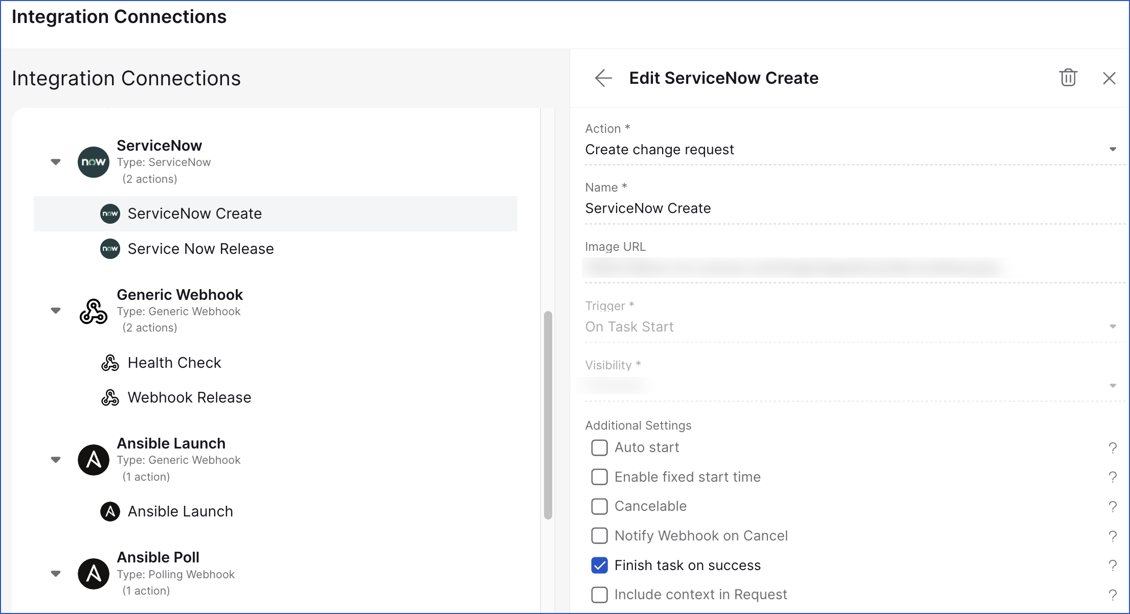
Figure 1. Original Integrations screen
Problem
Users encountered multiple barriers when managing integrations, spanning discovery, setup, and ongoing maintenance.
My Role
As a Junior UX/UI designer collaborating closely with a Product Designer on this four week project.
My responsibilities included:
- Defining the UX problem through research and mapping exercises
- Developing wireframes and high-fidelity UI concepts
- Synthesising stakeholder input into actionable improvements
- Presenting and iterating on feedback in design reviews
Process
Discovery & Analysis
I started by conducting exploratory research to define the scope and user pain points:
- How Might We workshops to uncover design opportunities
- Competitor analysis to study existing app marketplaces
- Persona development and use case mapping
- Red route and user flow analysis to identify friction points
Prototyping & Iteration
Based on findings, I created low-fidelity wireframes to explore new structures:
- Rebranded the section to “Integration Marketplace”
- Separated Installed Integrations from Available Integrations
- Introduced a grid of integration cards for visual clarity
- Added search, filters, and sort controls
- Created options to add custom integrations and request new ones
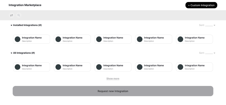
Figure 3. New Integrations screen low fidelity wireframes
After approval of wireframes, I moved to high-fidelity designs and prototypes:
- Updated the name from Integrations to Apps to make terminology more understandable
- Added category tags (pills) and banners for featured apps
- Introduced sort options (A-Z, Last Used, Last Viewed)
- Used larger cards for app detail visibility, including image, description and two CTAs
- Enabled filtering and show-more options in both Installed and Available sections
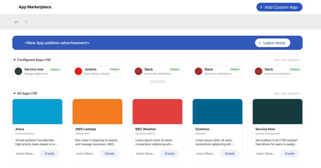
Figure 4. New Integrations screen in high fidelity
Feedback & Adjustments
Manager and team feedback focused on:
- Improving visual hierarchy and consistency in layout
- Clarifying alignment and connections between elements and steps in the user flow
- Suggesting a "What could have been" section to capture the vision beyond MVP
Outcomes
The redesigned marketplace was positively received by internal stakeholders. It offered:
- A clearer structure between installed and available apps
- More accessible navigation with filters, sort options, and visual grouping
- Customisation features (custom apps, request new) to meet future needs
- Scalable layout for a growing list of integrations
However, due to shifting priorities and resourcing constraints, the project was ultimately discontinued before development began.
Reflections
This project highlighted the value of structured thinking and scalable design, even when outcomes don’t lead to implementation. It taught me that:
- Good UX foundations can pivot into future solutions, even if paused
- Stakeholder alignment early on might have helped reduce risk of discontinuation
- Visual clarity and hierarchy were key to making a complex task feel simpler
- Strong concepts may resurface when timing aligns
- Partial wins are worth embracing
If given more time, responsibility and support, I would have:
- Explored interaction states (e.g. loading, install errors)
- Usability tested different card layouts with users
- Created a roadmap for phased rollout of the Marketplace
Let’s connect and work together!


Back to Portfolio
Marketplace Redesign
Read time: 7 minutes
Project date: 2022 - 2023
Designing an app marketplace for finding and configuring integrations
To improve discoverability and simplify the setup and management of integrations, I assisted in redesigning a cluttered, unintuitive interface into a structured, scalable App Marketplace. Over four weeks, I contributed to UX efforts; from research and ideation to high-fidelity design, crafting a solution focused on clarity, flexibility, and future growth.
Systems Design
Information Architecture
Platform UX
TL;DR...a quick snapshot of the project!
Project
Redesign the Integrations screen to improve how users discover, create, and manage third-party integrations across multiple workspaces.
Goal
Transform a cluttered, hard-to-navigate interface into a scalable App Marketplace with clearer structure, contextual support, and smoother workflows.
My Role
Junior UX Designer working in close collaboration with a Product Designer. I contributed to research, wireframing, and high-fidelity design, while helping facilitate alignment with product and development teams during a 4-week sprint.
Challenges
- Disorganised navigation and lack of visual grouping
- No filters, search, or sort functionality
- Inconsistent and unclear integration setup process
- Duplicate integrations with no user guidance
Outcomes
- Renamed the section to “Apps” with clear separation of Installed vs. Available
- Introduced cards, filters, sorting, and contextual tags
- Designed features for adding custom apps and requesting new ones
- Internal stakeholders praised the structure, clarity, and scalability
Impact
The project was ultimately paused due to shifting priorities, but the work laid a strong foundation for future improvements and demonstrated the value of structured UX thinking.
Context
The original Integrations screen allowed users to add and manage connections between external services (like Slack or ServiceNow) and the platform. However, the interface lacked discoverability, structure and contextual support, which negatively impacted user experience.
This redesign aimed to transform the screen into an App Marketplace, a space where users could easily find, understand, install and manage integrations across different workspaces and use cases.
Figure 1. Original Integrations screen
Problem
Users encountered multiple barriers when managing integrations, spanning discovery, setup, and ongoing maintenance.
Poor grouping and navigation
Lack of contextual information
Inconsistent “Add integration” patterns
No filters, search, or sort capabilities
Duplicate integrations across workspaces

Unclear navigation of integration options
Unclear purpose of certain integrations
Redundant steps and inefficient flows
Poor discoverability at scale
Operational complexity
My Role
As a Junior UX/UI designer collaborating closely with a Product Designer on this four week project.
My responsibilities included:
- Defining the UX problem through research and mapping exercises
- Developing wireframes and high-fidelity UI concepts
- Synthesising stakeholder input into actionable improvements
- Presenting and iterating on feedback in design reviews
Process
Discovery & Analysis
I started by conducting exploratory research to define the scope and user pain points:
- How Might We workshops to uncover design opportunities
- Competitor analysis to study existing app marketplaces
- Persona development and use case mapping
- Red route and user flow analysis to identify friction points
Prototyping & Iteration
Based on findings, I created low-fidelity wireframes to explore new structures:
- Rebranded the section to “Integration Marketplace”
- Separated Installed Integrations from Available Integrations
- Introduced a grid of integration cards for visual clarity
- Added search, filters, and sort controls
- Created options to add custom integrations and request new ones
Figure 3. New Integrations screen low fidelity wireframes
After approval of wireframes, I moved to high-fidelity designs and prototypes:
- Updated the name from Integrations to Apps to make terminology more understandable
- Added category tags (pills) and banners for featured apps
- Introduced sort options (A-Z, Last Used, Last Viewed)
- Used larger cards for app detail visibility, including image, description and two CTAs
- Enabled filtering and show-more options in both Installed and Available sections
Figure 4. New Integrations screen in high fidelity
Feedback & Adjustments
Manager and team feedback focused on:
- Improving visual hierarchy and consistency in layout
- Clarifying alignment and connections between elements and steps in the user flow
- Suggesting a "What could have been" section to capture the vision beyond MVP
Outcomes
The redesigned marketplace was positively received by internal stakeholders. It offered:
- A clearer structure between installed and available apps
- More accessible navigation with filters, sort options, and visual grouping
- Customisation features (custom apps, request new) to meet future needs
- Scalable layout for a growing list of integrations
However, due to shifting priorities and resourcing constraints, the project was ultimately discontinued before development began.
Reflections
This project highlighted the value of structured thinking and scalable design, even when outcomes don’t lead to implementation. It taught me that:
- Good UX foundations can pivot into future solutions, even if paused
- Stakeholder alignment early on might have helped reduce risk of discontinuation
- Visual clarity and hierarchy were key to making a complex task feel simpler
- Strong concepts may resurface when timing aligns
- Partial wins are worth embracing
If given more time, responsibility and support, I would have:
- Explored interaction states (e.g. loading, install errors)
- Usability tested different card layouts with users
- Created a roadmap for phased rollout of the Marketplace
Let’s connect and work together!
Back to Portfolio
Marketplace Redesign
Read time: 7 minutes
Project date: 2022 - 2023
Designing an app marketplace for finding and configuring integrations
To improve discoverability and simplify the setup and management of integrations, I assisted in redesigning a cluttered, unintuitive interface into a structured, scalable App Marketplace. Over four weeks, I contributed to UX efforts; from research and ideation to high-fidelity design, crafting a solution focused on clarity, flexibility, and future growth.
Systems Design
Information Architecture
Platform UX
TL;DR...a quick snapshot of the project!
Project
Redesign the Integrations screen to improve how users discover, create, and manage third-party integrations across multiple workspaces.
Goal
Transform a cluttered, hard-to-navigate interface into a scalable App Marketplace with clearer structure, contextual support, and smoother workflows.
My Role
Junior UX Designer working in close collaboration with a Product Designer. I contributed to research, wireframing, and high-fidelity design, while helping facilitate alignment with product and development teams during a 4-week sprint.
Challenges
- Disorganised navigation and lack of visual grouping
- No filters, search, or sort functionality
- Inconsistent and unclear integration setup process
- Duplicate integrations with no user guidance
Outcomes
- Renamed the section to “Apps” with clear separation of Installed vs. Available
- Introduced cards, filters, sorting, and contextual tags
- Designed features for adding custom apps and requesting new ones
- Internal stakeholders praised the structure, clarity, and scalability
Impact
The project was ultimately paused due to shifting priorities, but the work laid a strong foundation for future improvements and demonstrated the value of structured UX thinking.
Context
The original Integrations screen allowed users to add and manage connections between external services (like Slack or ServiceNow) and the platform. However, the interface lacked discoverability, structure and contextual support, which negatively impacted user experience.
This redesign aimed to transform the screen into an App Marketplace, a space where users could easily find, understand, install and manage integrations across different workspaces and use cases.
Figure 1. Original Integrations screen
Problem
Users encountered multiple barriers when managing integrations, spanning discovery, setup, and ongoing maintenance.
Poor grouping and navigation
Lack of contextual information
Inconsistent “Add integration” patterns
No filters, search, or sort capabilities
Duplicate integrations across workspaces
Unclear navigation of integration options
Unclear purpose of certain integrations
Redundant steps and inefficient flows
Poor discoverability at scale
Operational complexity
My Role
As a Junior UX/UI designer collaborating closely with a Product Designer on this four week project.
My responsibilities included:
- Defining the UX problem through research and mapping exercises
- Developing wireframes and high-fidelity UI concepts
- Synthesising stakeholder input into actionable improvements
- Presenting and iterating on feedback in design reviews
Process
Discovery & Analysis
I started by conducting exploratory research to define the scope and user pain points:
- How Might We workshops to uncover design opportunities
- Competitor analysis to study existing app marketplaces
- Persona development and use case mapping
- Red route and user flow analysis to identify friction points
Prototyping & Iteration
Based on findings, I created low-fidelity wireframes to explore new structures:
- Rebranded the section to “Integration Marketplace”
- Separated Installed Integrations from Available Integrations
- Introduced a grid of integration cards for visual clarity
- Added search, filters, and sort controls
- Created options to add custom integrations and request new ones
Figure 3. New Integrations screen low fidelity wireframes
After approval of wireframes, I moved to high-fidelity designs and prototypes:
- Updated the name from Integrations to Apps to make terminology more understandable
- Added category tags (pills) and banners for featured apps
- Introduced sort options (A-Z, Last Used, Last Viewed)
- Used larger cards for app detail visibility, including image, description and two CTAs
- Enabled filtering and show-more options in both Installed and Available sections
Figure 4. New Integrations screen in high fidelity
Feedback & Adjustments
Manager and team feedback focused on:
- Improving visual hierarchy and consistency in layout
- Clarifying alignment and connections between elements and steps in the user flow
- Suggesting a "What could have been" section to capture the vision beyond MVP
Outcomes
The redesigned marketplace was positively received by internal stakeholders. It offered:
- A clearer structure between installed and available apps
- More accessible navigation with filters, sort options, and visual grouping
- Customisation features (custom apps, request new) to meet future needs
- Scalable layout for a growing list of integrations
However, due to shifting priorities and resourcing constraints, the project was ultimately discontinued before development began.
Reflections
This project highlighted the value of structured thinking and scalable design, even when outcomes don’t lead to implementation. It taught me that:
- Good UX foundations can pivot into future solutions, even if paused
- Stakeholder alignment early on might have helped reduce risk of discontinuation
- Visual clarity and hierarchy were key to making a complex task feel simpler
- Strong concepts may resurface when timing aligns
- Partial wins are worth embracing
If given more time, responsibility and support, I would have:
- Explored interaction states (e.g. loading, install errors)
- Usability tested different card layouts with users
- Created a roadmap for phased rollout of the Marketplace
Let’s connect and work together!