Leonard Egwuekwe
Menu
Work
About
Contact

Back to Portfolio
Mobile Audit for a Persona
Read time: 7 minutes
Project date: 2022 - 2023
Auditing mobile UX through the lens of real user needs
Conducted a persona-focused mobile audit to identify usability gaps, accessibility issues, and quick-win improvements.
UX Audit
Mobile UX
Personas
TL;DR...a quick snapshot of the project!
Project
Mobile audit of the Cutover platform to improve usability for Task Executors.
Goal
Identify mobile UX issues, propose quick design fixes, and lay groundwork for mobile parity with the desktop experience.
My Role
Junior UX Designer, led audit, user-centred proposals, and design recommendations.
Challenges
- Branding inconsistencies and poor mobile practices
- Overcrowded layouts, redundant CTAs, small click areas
- Increased support requests due to poor mobile usability
Outcomes
- Introduced “My Tasks” section for targeted access
- Widget layout chosen (64.3% preference) for clarity & usability
- Colour-coded status and email notifications for better task tracking
- Streamlined terminology across the platform
Impact
Improved clarity and usability for Task Executors, reduced design debt, and provided a foundation for ongoing mobile improvements.
Context
Cutover is a platform for managing complex, collaborative work in critical scenarios such as cutovers, migrations, and major events. While the desktop platform had received significant updates, the mobile experience lagged behind, leading to usability issues, branding inconsistencies, and frequent support requests.
Task Executors, a primary user group, depend heavily on mobile for on-the-go access. This made the audit urgent.
Problem
We hypothesised that returning or confident users might find this information redundant, potentially leading to frustration or drop-off.
My Role
As a Junior UX/UI designer collaborating closely with a Product Designer on this four week project:
- Conducted an audit of the mobile UX
- Identified quick wins and prioritised proposals
- Designed adjustments aligned to accessibility and usability
- Grounded decisions in the Task Executor persona
Process
Audit Findings
- Homepage: overcrowded elements, redundant CTAs, inconsistent styling, broken hierarchy.
- Workspaces List: buttons are cluttered together, limited clickable areas, cluttered interface, poor visibility.
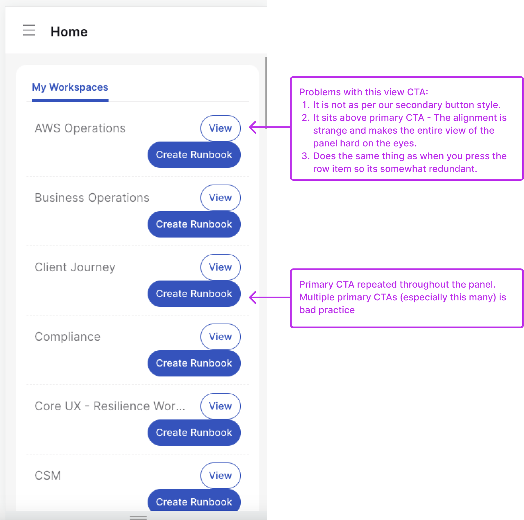
Figure 1. Findings form mobile audit of the homepage
Proposed Adjustments
- Hide: redundant CTAs, hover states unsuited for mobile, unnecessary bulk actions, irrelevant menu items.
- Add: bottom navigation bar, larger clickable areas, simplified Runbook access, filters for easier navigation, streamlined terminology.
- Fix: styling inconsistencies, hierarchy misplacements, cluttered layouts.
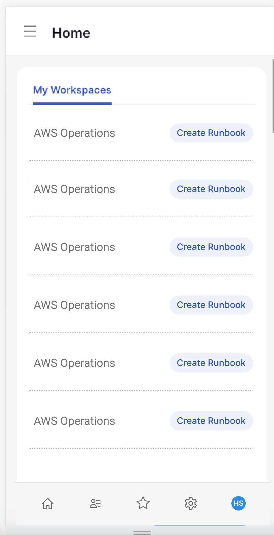
Figure 2. Design solution for homepage
Outcomes
Given that Task Executors struggled with accidental taps and clutter when accessing Runbooks, the solution was to increase the clickable areas, remove redundant bulk actions, and introduce a filter for quicker navigation. This created a smoother, more reliable mobile workflow.
Reflections
Mobile design debt builds quickly when desktop takes priority, to mitigate that, regular audits are essential.
Not every project needs a large overhaul or fancy & trendy redesign, small adjustments (removing clutter, fixing hierarchy) can dramatically improve usability.
There is a lot of potential scope in this project, where more testing and exploring the art of the possible can help refine the mobile experience.
Let’s connect and work together!


Back to Portfolio
Mobile Audit for a Persona
Read time: 7 minutes
Project date: 2022 - 2023
Auditing mobile UX through the lens of real user needs
Conducted a persona-focused mobile audit to identify usability gaps, accessibility issues, and quick-win improvements.
UX Audit
Mobile UX
Personas
TL;DR...a quick snapshot of the project!
Project
Mobile audit of the Cutover platform to improve usability for Task Executors.
Goal
Identify mobile UX issues, propose quick design fixes, and lay groundwork for mobile parity with the desktop experience.
My Role
Junior UX Designer, led audit, user-centred proposals, and design recommendations.
Challenges
- Branding inconsistencies and poor mobile practices
- Overcrowded layouts, redundant CTAs, small click areas
- Increased support requests due to poor mobile usability
Outcomes
- Introduced “My Tasks” section for targeted access
- Widget layout chosen (64.3% preference) for clarity & usability
- Colour-coded status and email notifications for better task tracking
- Streamlined terminology across the platform
Impact
Improved clarity and usability for Task Executors, reduced design debt, and provided a foundation for ongoing mobile improvements.
Context
Cutover is a platform for managing complex, collaborative work in critical scenarios such as cutovers, migrations, and major events. While the desktop platform had received significant updates, the mobile experience lagged behind, leading to usability issues, branding inconsistencies, and frequent support requests.
Task Executors, a primary user group, depend heavily on mobile for on-the-go access. This made the audit urgent.
Problem
We hypothesised that returning or confident users might find this information redundant, potentially leading to frustration or drop-off.
Design neglect
Redundant CTAs and small touch targets
Poor mobile UX standards
Low mobile usability

Cluttered layouts and inconsistencies
Interaction errors and accessibility issues
Reduced adoption and retention
Increased reliance on retaining and support
My Role
As a Junior UX/UI designer collaborating closely with a Product Designer on this four week project:
- Conducted an audit of the mobile UX
- Identified quick wins and prioritised proposals
- Designed adjustments aligned to accessibility and usability
- Grounded decisions in the Task Executor persona
Process
Audit Findings
- Homepage: overcrowded elements, redundant CTAs, inconsistent styling, broken hierarchy.
- Workspaces List: buttons are cluttered together, limited clickable areas, cluttered interface, poor visibility.
Figure 1. Findings form mobile audit of the homepage
Proposed Adjustments
- Hide: redundant CTAs, hover states unsuited for mobile, unnecessary bulk actions, irrelevant menu items.
- Add: bottom navigation bar, larger clickable areas, simplified Runbook access, filters for easier navigation, streamlined terminology.
- Fix: styling inconsistencies, hierarchy misplacements, cluttered layouts.
Figure 2. Design solution for homepage
Outcomes
Given that Task Executors struggled with accidental taps and clutter when accessing Runbooks, the solution was to increase the clickable areas, remove redundant bulk actions, and introduce a filter for quicker navigation. This created a smoother, more reliable mobile workflow.
Reflections
Mobile design debt builds quickly when desktop takes priority, to mitigate that, regular audits are essential.
Not every project needs a large overhaul or fancy & trendy redesign, small adjustments (removing clutter, fixing hierarchy) can dramatically improve usability.
There is a lot of potential scope in this project, where more testing and exploring the art of the possible can help refine the mobile experience.
Let’s connect and work together!
Back to Portfolio
Mobile Audit for a Persona
Read time: 7 minutes
Project date: 2022 - 2023
Auditing mobile UX through the lens of real user needs
Conducted a persona-focused mobile audit to identify usability gaps, accessibility issues, and quick-win improvements.
UX Audit
Mobile UX
Personas
TL;DR...a quick snapshot of the project!
Project
Mobile audit of the Cutover platform to improve usability for Task Executors.
Goal
Identify mobile UX issues, propose quick design fixes, and lay groundwork for mobile parity with the desktop experience.
My Role
Junior UX Designer, led audit, user-centred proposals, and design recommendations.
Challenges
- Branding inconsistencies and poor mobile practices
- Overcrowded layouts, redundant CTAs, small click areas
- Increased support requests due to poor mobile usability
Outcomes
- Introduced “My Tasks” section for targeted access
- Widget layout chosen (64.3% preference) for clarity & usability
- Colour-coded status and email notifications for better task tracking
- Streamlined terminology across the platform
Impact
Improved clarity and usability for Task Executors, reduced design debt, and provided a foundation for ongoing mobile improvements.
Context
Cutover is a platform for managing complex, collaborative work in critical scenarios such as cutovers, migrations, and major events. While the desktop platform had received significant updates, the mobile experience lagged behind, leading to usability issues, branding inconsistencies, and frequent support requests.
Task Executors, a primary user group, depend heavily on mobile for on-the-go access. This made the audit urgent.
Problem
We hypothesised that returning or confident users might find this information redundant, potentially leading to frustration or drop-off.
Design neglect
Redundant CTAs and small touch targets
Poor mobile UX standards
Low mobile usability
Cluttered layouts and inconsistencies
Interaction errors and accessibility issues
Reduced adoption and retention
Increased reliance on retaining and support
My Role
As a Junior UX/UI designer collaborating closely with a Product Designer on this four week project:
- Conducted an audit of the mobile UX
- Identified quick wins and prioritised proposals
- Designed adjustments aligned to accessibility and usability
- Grounded decisions in the Task Executor persona
Process
Audit Findings
- Homepage: overcrowded elements, redundant CTAs, inconsistent styling, broken hierarchy.
- Workspaces List: buttons are cluttered together, limited clickable areas, cluttered interface, poor visibility.
Figure 1. Findings form mobile audit of the homepage
Proposed Adjustments
- Hide: redundant CTAs, hover states unsuited for mobile, unnecessary bulk actions, irrelevant menu items.
- Add: bottom navigation bar, larger clickable areas, simplified Runbook access, filters for easier navigation, streamlined terminology.
- Fix: styling inconsistencies, hierarchy misplacements, cluttered layouts.
Figure 2. Design solution for homepage
Outcomes
Given that Task Executors struggled with accidental taps and clutter when accessing Runbooks, the solution was to increase the clickable areas, remove redundant bulk actions, and introduce a filter for quicker navigation. This created a smoother, more reliable mobile workflow.
Reflections
Mobile design debt builds quickly when desktop takes priority, to mitigate that, regular audits are essential.
Not every project needs a large overhaul or fancy & trendy redesign, small adjustments (removing clutter, fixing hierarchy) can dramatically improve usability.
There is a lot of potential scope in this project, where more testing and exploring the art of the possible can help refine the mobile experience.
Let’s connect and work together!