Leonard Egwuekwe
Menu
Work
About
Contact

Back to Portfolio
User-Centric Hero Areas
Read time: 7 minutes
Project date: 2024 - 2025
Turning first impressions into clear user value
Tested different ways to make hero areas content optional without losing helpful context for new users. As the lead UX designer, I created five prototypes, ran usability tests, then analysed and reported on results.
Usability Testing
Research
Ideation
TL;DR...a quick snapshot of the project!
Project
Exploring interaction patterns to make hero content optional while retaining value for new or less tech-confident users.
Goal
Balance guidance with efficiency by giving users control over whether to view introductory content on each page.
My Role
I led the UX design and research process, designed and tested five prototypes, ran unmoderated usability testing via Lyssna and synthesised findings into design recommendations.
Challenges
- Catering to both first-time and returning users
- Avoiding intrusive or unclear interactions
- Ensuring accessibility and clarity in reduced formats
Outcomes
- Identified a preferred interaction pattern that offered clarity without being intrusive
- Highlighted the need for clearer labels, triggering the need for an audit on labels and hierarchy
- Gathered actionable feedback to inform future content and layout decisions
Impact
This work provided evidence-based direction for improving the user experience of hero areas and contributed to more inclusive, adaptable content design. It directly informed design decisions for the Tech Guide and reinforced the value of user-led testing in shaping accessible and efficient interfaces.
Context
The Parkinson’s UK Tech Guide supports people living with Parkinson’s in discovering and using helpful digital products. Each page begins with a hero area, a short description of what the page contains and how to use it. These introductory blocks are designed to reduce cognitive load for users unfamiliar with the content or who need guidance navigating digital
interfaces.
However, repeated feedback from users and stakeholders highlighted a friction point: the hero content, while helpful to some, became redundant or intrusive for more experienced users, particularly those returning to the site.
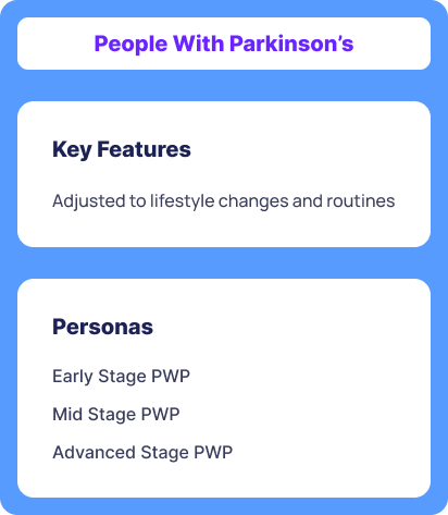
Figure 1. People with Parkinson’s Archetype
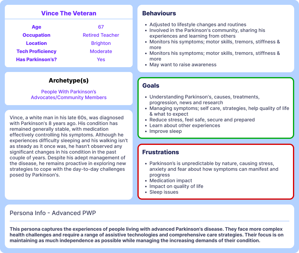
Figure 2. Advanced Person with Parkinson’s Persona
Problem
The question was
How can the guidance and clarity offered by hero areas for new users be retained, while reducing friction or redundancy for returning or tech-savvy users?
We hypothesised that returning or confident users might find this information redundant, potentially leading to frustration or drop-off.
My Role
As the Lead/Sole UX/UI designer on the Tech Guide, my responsibilities included:
- Designing five alternative interaction patterns
- Writing task flows and microcopy
- Setting up unmoderated usability tests on Lyssna
- Synthesising user insights and producing clear design recommendations
Process
Prototype Development
Using Figma, I created five interaction patterns to explore different ways of presenting or hiding the hero content:
- A Modal
- An expanding box, very similar to an accordion
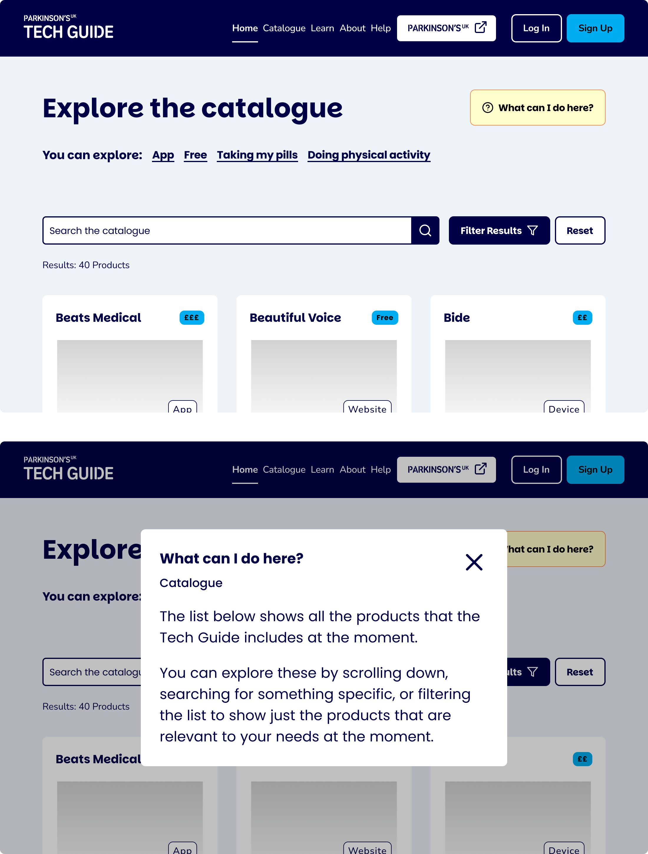
Figure 3. Design idea 1: Modal
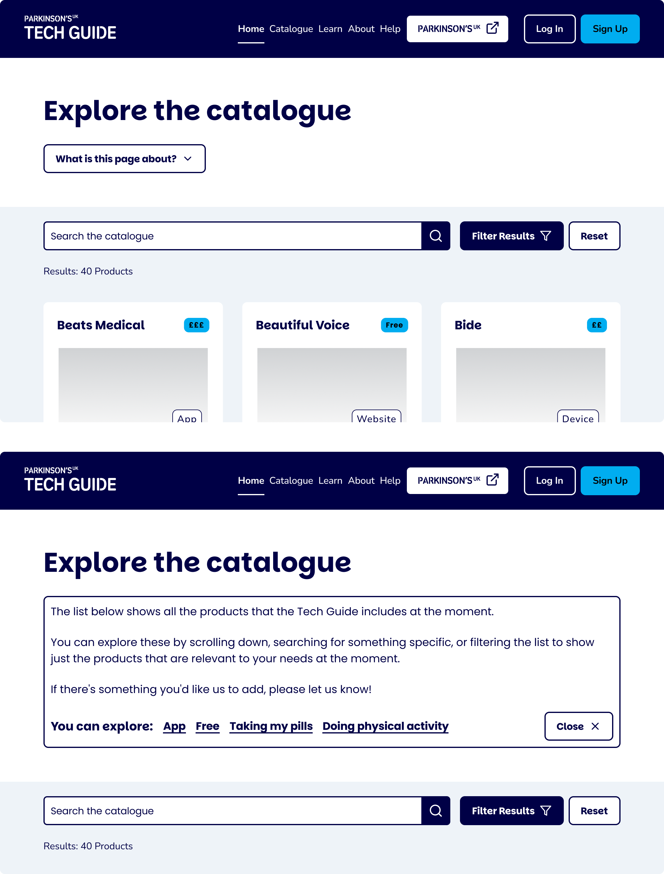
Figure 4. Design idea 2: Expanding Box
- A Flyover tooltip
- An accordion variant (variant A)
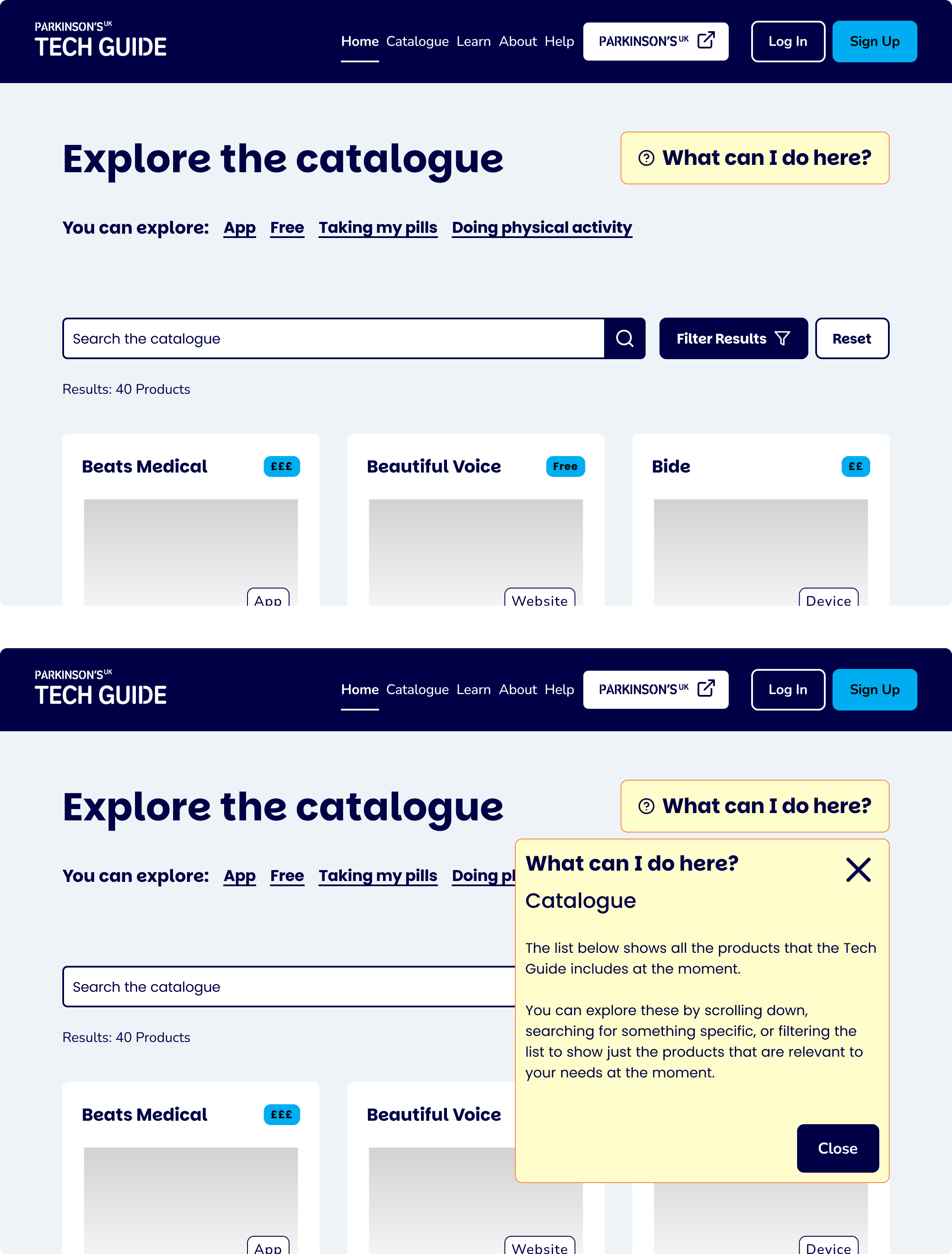
Figure 5. Design idea 3: Flyover
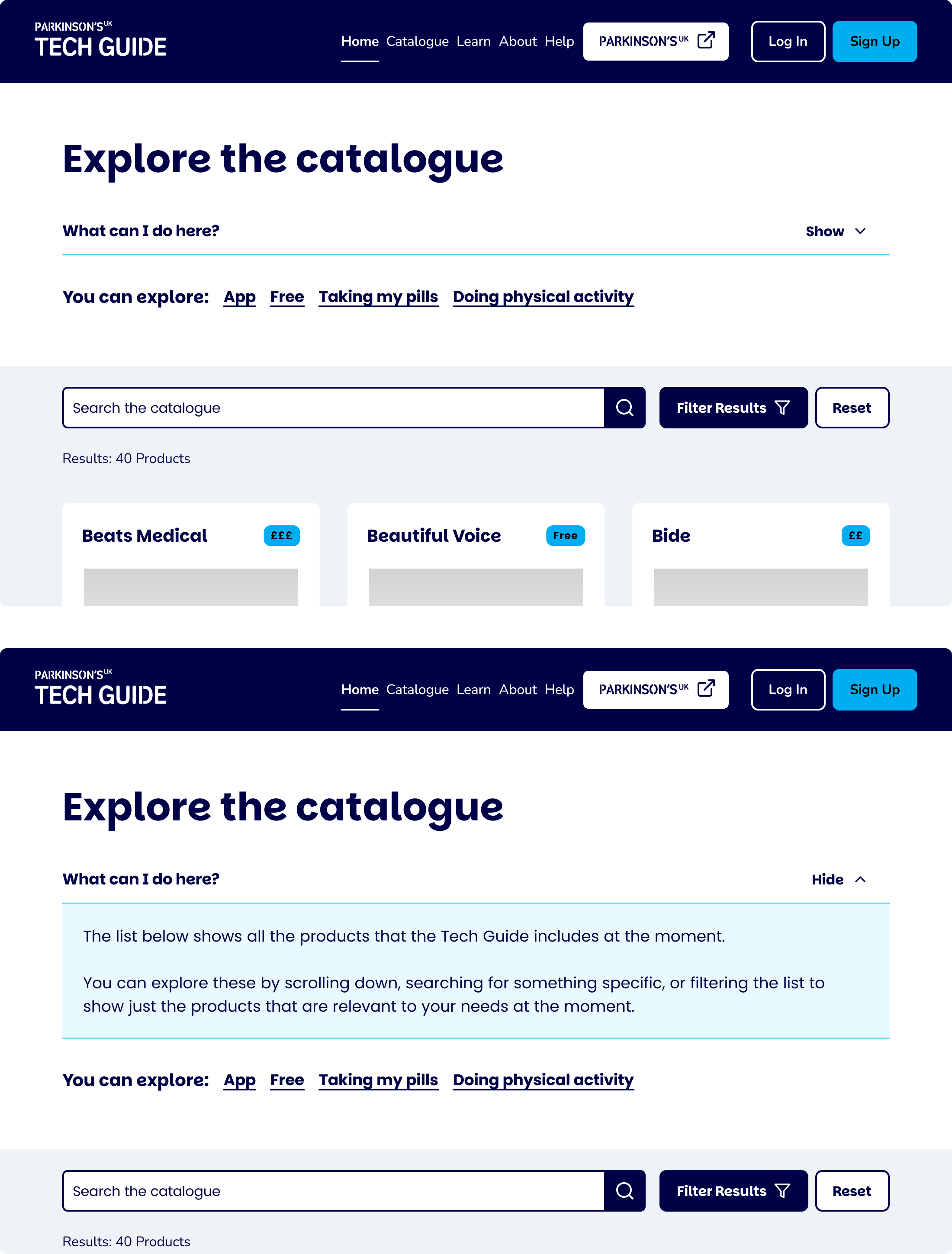
Figure 5. Design idea 4: Accordion A - Blue Line
- An accordion variant (variant B)
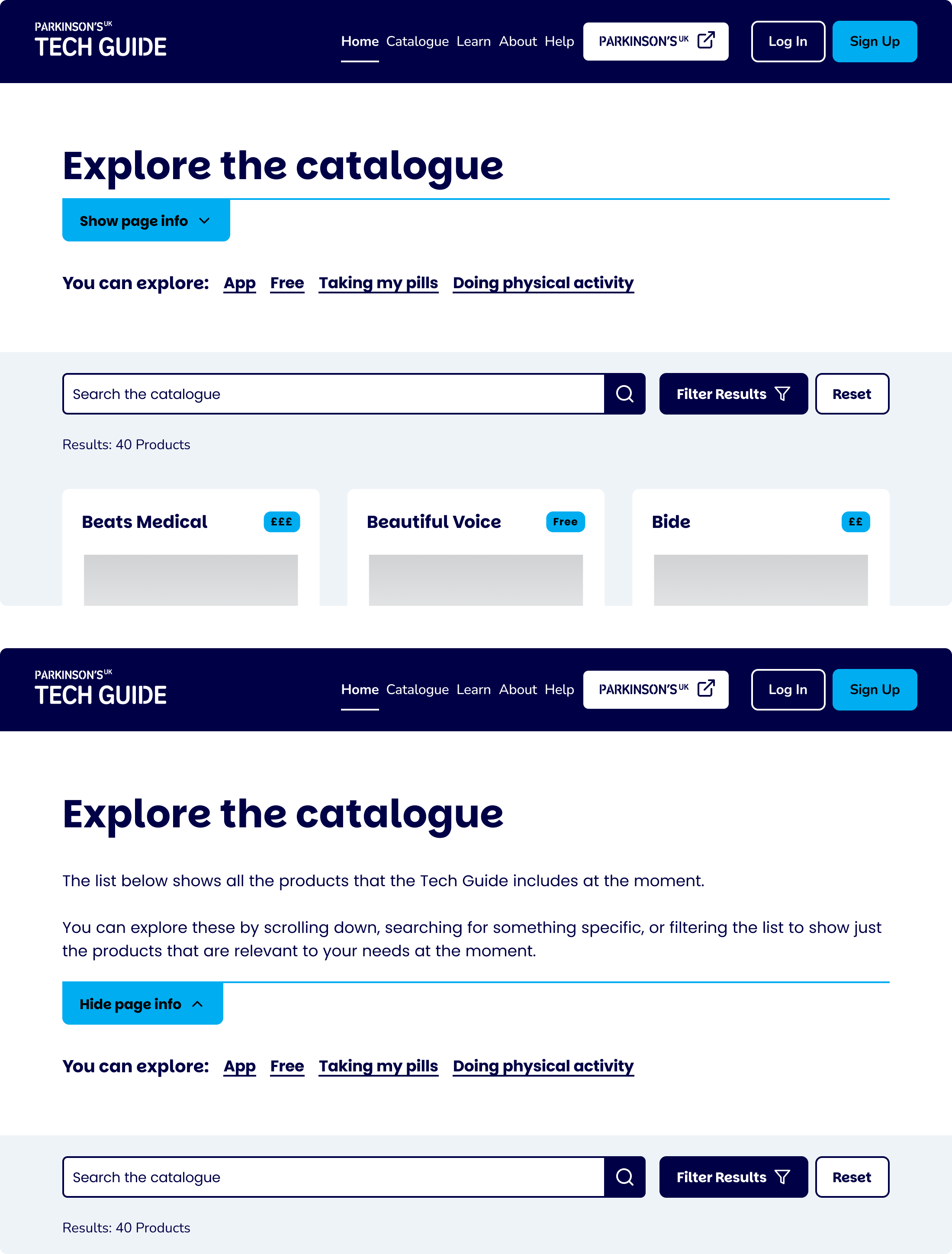
Figure 6. Design idea 5: Accordion B - Button
Usability Testing
Using Lyssna, I launched an unmoderated usability study, where:
- 37 participants signed up
- 27 completed the test
- Participants were asked to complete basic tasks, rate the experience and answer follow-up questions about clarity, design ranking and usefulness
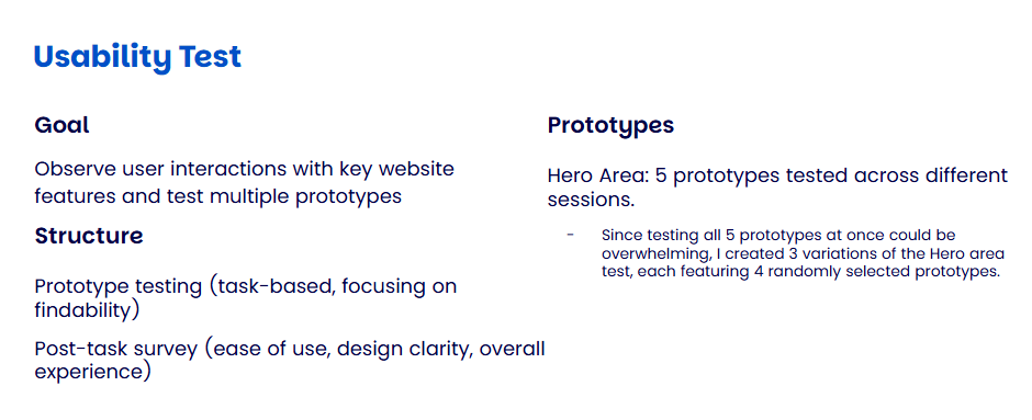
Figure 7. Usability Test: Goal and Structure
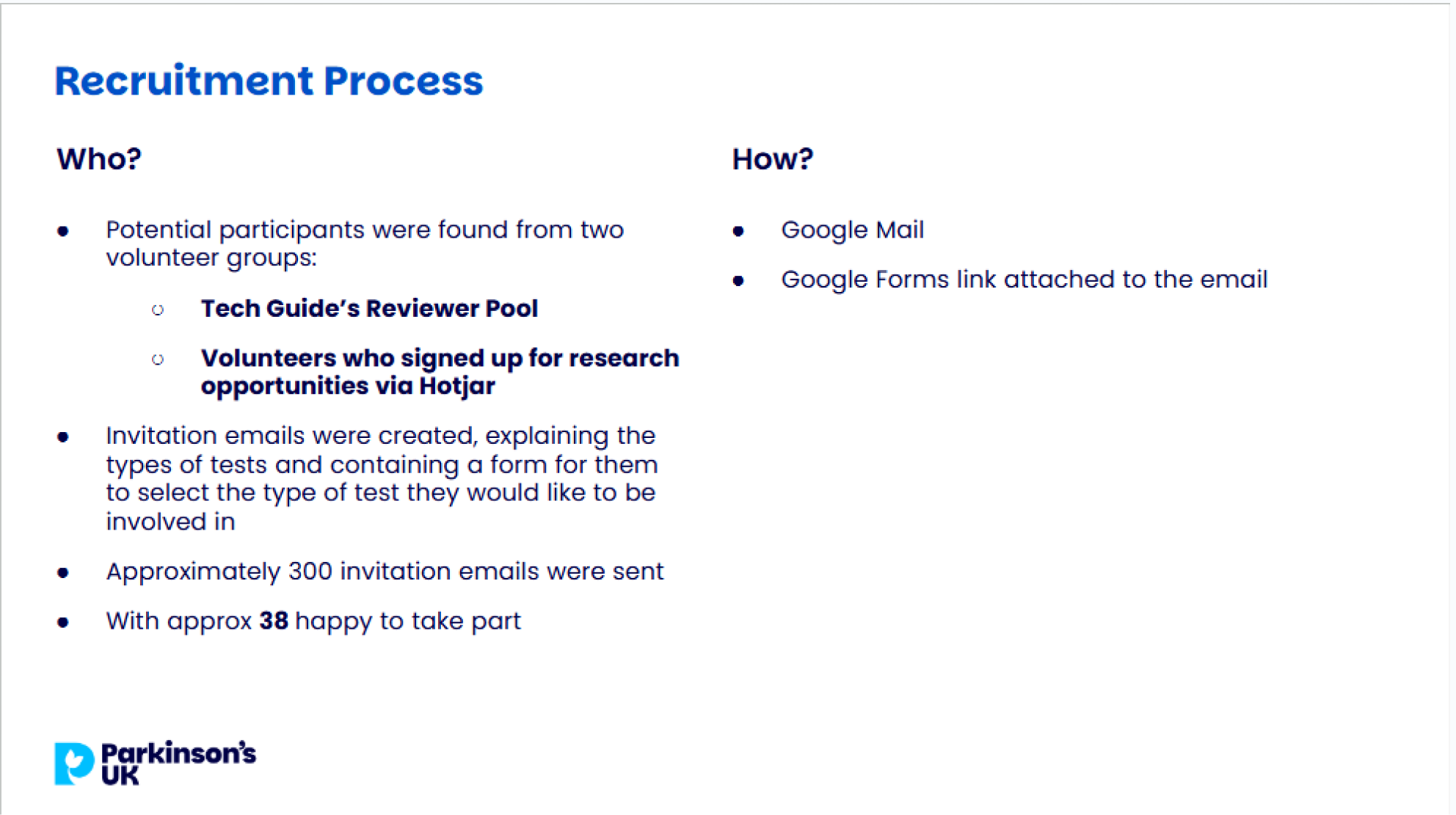
Figure 8. Recruitment process
Analysis
I evaluated the designs based on:
- Task completion speed
- Clarity of purpose
- User ratings and preferences
- Comments around language, labelling and interaction affordances
Outcomes
After the testing, the following were discovered:
- One design emerged as the most balanced solution, offering visibility and clarity for those who needed guidance, but easily dismissible for those who didn’t
- Modal and flyover options showed the best performance metrics but were sometimes described as “disruptive”
- Accordions underperformed, often missed or misunderstood
- Clear labelling (e.g., “What this page is about”) significantly improved comprehension
- Recommendations focused on making the hero area optional but discoverable, using visual hierarchy and consistent patterns
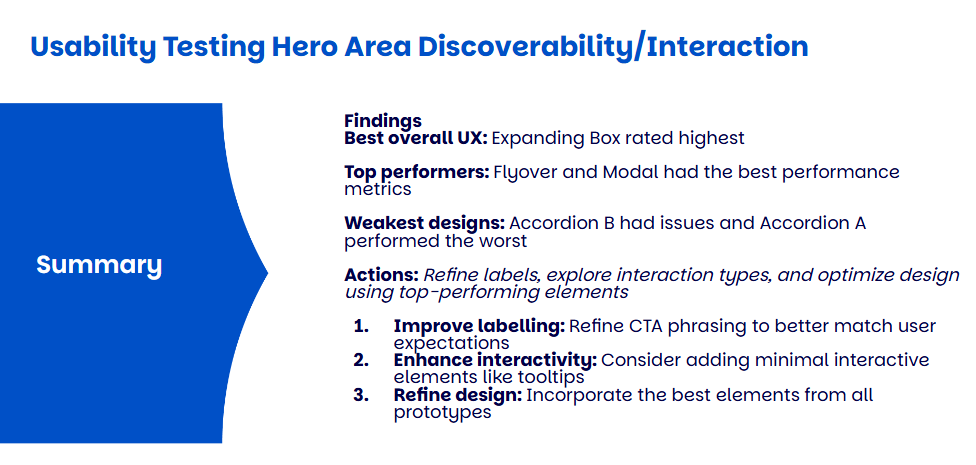
Figure 9. Results summary
Reflections
This project highlighted the importance of flexible, inclusive design, especially when your user base ranges from digital newcomers to confident returners. Providing guidance shouldn’t come at the cost of speed or autonomy. Giving users control over the interface allowed us to preserve accessibility for those who need it while streamlining the experience for others.
It also reinforced the value of testing even small interface elements. What seemed like a simple block of text was a point of tension for users. Prototyping and testing helped us see that micro-interactions can significantly affect comfort, clarity and trust.
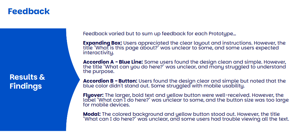
Figure 10. Summary of feedback
Let’s connect and work together!


Back to Portfolio
User-Centric Hero Areas
Read time: 7 minutes
Project date: 2024 - 2025
Turning first impressions into clear user value
Tested different ways to make hero areas content optional without losing helpful context for new users. As the lead UX designer, I created five prototypes, ran usability tests, then analysed and reported on results.
Usability Testing
Research
Ideation
TL;DR...a quick snapshot of the project!
Project
Exploring interaction patterns to make hero content optional while retaining value for new or less tech-confident users.
Goal
Balance guidance with efficiency by giving users control over whether to view introductory content on each page.
My Role
I led the UX design and research process, designed and tested five prototypes, ran unmoderated usability testing via Lyssna and synthesised findings into design recommendations.
Challenges
- Catering to both first-time and returning users
- Avoiding intrusive or unclear interactions
- Ensuring accessibility and clarity in reduced formats
Outcomes
- Identified a preferred interaction pattern that offered clarity without being intrusive
- Highlighted the need for clearer labels, triggering the need for an audit on labels and hierarchy
- Gathered actionable feedback to inform future content and layout decisions
Impact
This work provided evidence-based direction for improving the user experience of hero areas and contributed to more inclusive, adaptable content design. It directly informed design decisions for the Tech Guide and reinforced the value of user-led testing in shaping accessible and efficient interfaces.
Context
The Parkinson’s UK Tech Guide supports people living with Parkinson’s in discovering and using helpful digital products. Each page begins with a hero area, a short description of what the page contains and how to use it. These introductory blocks are designed to reduce cognitive load for users unfamiliar with the content or who need guidance navigating digital
interfaces.
However, repeated feedback from users and stakeholders highlighted a friction point: the hero content, while helpful to some, became redundant or intrusive for more experienced users, particularly those returning to the site.
Figure 1. People with Parkinson’s Archetype
Figure 2. Advanced Person with Parkinson’s Persona
Problem
We hypothesised that returning or confident users might find this information redundant, potentially leading to frustration or drop-off.
The question was
How can the guidance and clarity offered by hero areas for new users be retained, while reducing friction or redundancy for returning or tech-savvy users?
My Role
As the Lead/Sole UX/UI designer on the Tech Guide, my responsibilities included:
- Designing five alternative interaction patterns
- Writing task flows and microcopy
- Setting up unmoderated usability tests on Lyssna
- Synthesising user insights and producing clear design recommendations
Process
Prototype Development
Using Figma, I created five interaction patterns to explore different ways of presenting or hiding the hero content:
- A Modal
- An expanding box, very similar to an accordion
Figure 3. Design idea 1: Modal
Figure 4. Design idea 2: Expanding Box
- A Flyover tooltip
- An accordion variant (variant A)
Figure 5. Design idea 3: Flyover
Figure 5. Design idea 4: Accordion A - Blue Line
- An accordion variant (variant B)
Figure 6. Design idea 5: Accordion B - Button
Usability Testing
Using Lyssna, I launched an unmoderated usability study, where:
- 37 participants signed up
- 27 completed the test
- Participants were asked to complete basic tasks, rate the experience and answer follow-up questions about clarity, design ranking and usefulness
Figure 7. Usability Test: Goal and Structure
Figure 8. Recruitment process
Analysis
I evaluated the designs based on:
- Task completion speed
- Clarity of purpose
- User ratings and preferences
- Comments around language, labelling and interaction affordances
Outcomes
After the testing, the following were discovered:
- One design emerged as the most balanced solution, offering visibility and clarity for those who needed guidance, but easily dismissible for those who didn’t
- Modal and flyover options showed the best performance metrics but were sometimes described as “disruptive”
- Accordions underperformed, often missed or misunderstood
- Clear labelling (e.g., “What this page is about”) significantly improved comprehension
- Recommendations focused on making the hero area optional but discoverable, using visual hierarchy and consistent patterns
Figure 9. Results summary
Reflections
This project highlighted the importance of flexible, inclusive design, especially when your user base ranges from digital newcomers to confident returners. Providing guidance shouldn’t come at the cost of speed or autonomy. Giving users control over the interface allowed us to preserve accessibility for those who need it while streamlining the experience for others.
It also reinforced the value of testing even small interface elements. What seemed like a simple block of text was a point of tension for users. Prototyping and testing helped us see that micro-interactions can significantly affect comfort, clarity and trust.
Figure 10. Summary of feedback
Let’s connect and work together!
Back to Portfolio
User-Centric Hero Areas
Read time: 7 minutes
Project date: 2024 - 2025
Turning first impressions into clear user value
Tested different ways to make hero areas content optional without losing helpful context for new users. As the lead UX designer, I created five prototypes, ran usability tests, then analysed and reported on results.
Usability Testing
Research
Ideation
TL;DR...a quick snapshot of the project!
Project
Exploring interaction patterns to make hero content optional while retaining value for new or less tech-confident users.
Goal
Balance guidance with efficiency by giving users control over whether to view introductory content on each page.
My Role
I led the UX design and research process, designed and tested five prototypes, ran unmoderated usability testing via Lyssna and synthesised findings into design recommendations.
Challenges
- Catering to both first-time and returning users
- Avoiding intrusive or unclear interactions
- Ensuring accessibility and clarity in reduced formats
Outcomes
- Identified a preferred interaction pattern that offered clarity without being intrusive
- Highlighted the need for clearer labels, triggering the need for an audit on labels and hierarchy
- Gathered actionable feedback to inform future content and layout decisions
Impact
This work provided evidence-based direction for improving the user experience of hero areas and contributed to more inclusive, adaptable content design. It directly informed design decisions for the Tech Guide and reinforced the value of user-led testing in shaping accessible and efficient interfaces.
Context
The Parkinson’s UK Tech Guide supports people living with Parkinson’s in discovering and using helpful digital products. Each page begins with a hero area, a short description of what the page contains and how to use it. These introductory blocks are designed to reduce cognitive load for users unfamiliar with the content or who need guidance navigating digital
interfaces.
However, repeated feedback from users and stakeholders highlighted a friction point: the hero content, while helpful to some, became redundant or intrusive for more experienced users, particularly those returning to the site.
Figure 1. People with Parkinson’s Archetype
Figure 2. Advanced Person with Parkinson’s Persona
Problem
We hypothesised that returning or confident users might find this information redundant, potentially leading to frustration or drop-off.
The question was
How can the guidance and clarity offered by hero areas for new users be retained, while reducing friction or redundancy for returning or tech-savvy users?
My Role
As the Lead/Sole UX/UI designer on the Tech Guide, my responsibilities included:
- Designing five alternative interaction patterns
- Writing task flows and microcopy
- Setting up unmoderated usability tests on Lyssna
- Synthesising user insights and producing clear design recommendations
Process
Prototype Development
Using Figma, I created five interaction patterns to explore different ways of presenting or hiding the hero content:
- A Modal
- An expanding box, very similar to an accordion
Figure 3. Design idea 1: Modal
Figure 4. Design idea 2: Expanding Box
- A Flyover tooltip
- An accordion variant (variant A)
Figure 5. Design idea 3: Flyover
Figure 5. Design idea 4: Accordion A - Blue Line
- An accordion variant (variant B)
Figure 6. Design idea 5: Accordion B - Button
Usability Testing
Using Lyssna, I launched an unmoderated usability study, where:
- 37 participants signed up
- 27 completed the test
- Participants were asked to complete basic tasks, rate the experience and answer follow-up questions about clarity, design ranking and usefulness
Figure 7. Usability Test: Goal and Structure
Figure 8. Recruitment process
Analysis
I evaluated the designs based on:
- Task completion speed
- Clarity of purpose
- User ratings and preferences
- Comments around language, labelling and interaction affordances
Outcomes
After the testing, the following were discovered:
- One design emerged as the most balanced solution, offering visibility and clarity for those who needed guidance, but easily dismissible for those who didn’t
- Modal and flyover options showed the best performance metrics but were sometimes described as “disruptive”
- Accordions underperformed, often missed or misunderstood
- Clear labelling (e.g., “What this page is about”) significantly improved comprehension
- Recommendations focused on making the hero area optional but discoverable, using visual hierarchy and consistent patterns
Figure 9. Results summary
Reflections
This project highlighted the importance of flexible, inclusive design, especially when your user base ranges from digital newcomers to confident returners. Providing guidance shouldn’t come at the cost of speed or autonomy. Giving users control over the interface allowed us to preserve accessibility for those who need it while streamlining the experience for others.
It also reinforced the value of testing even small interface elements. What seemed like a simple block of text was a point of tension for users. Prototyping and testing helped us see that micro-interactions can significantly affect comfort, clarity and trust.
Figure 10. Summary of feedback
Let’s connect and work together!